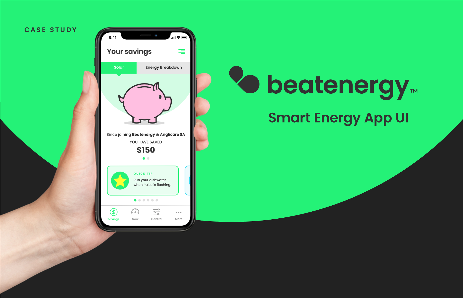
The problem
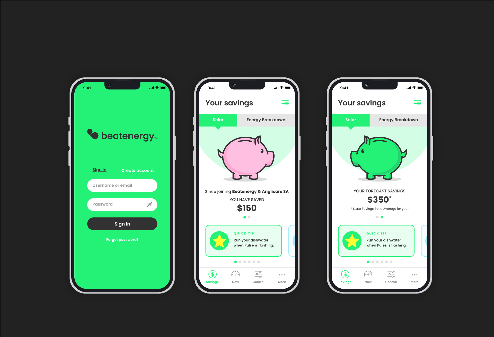
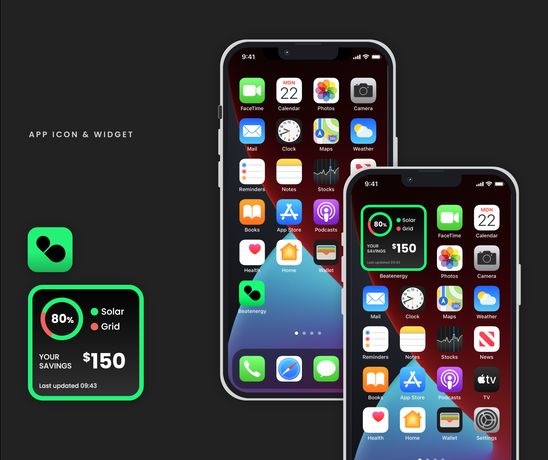
The smart energy sector is complicated – but it doesn’t need to be. Beat Energy, a developer of innovative energy solutions engaged Red5 Creative to create their new app UI look and feel. They required a fresh and inviting design approach that would appeal to their customers and encourage them to make use of the app data. Red5 Creative also built on their visual identity assets, improving on the typography, colourways and the logo itself.
The solution
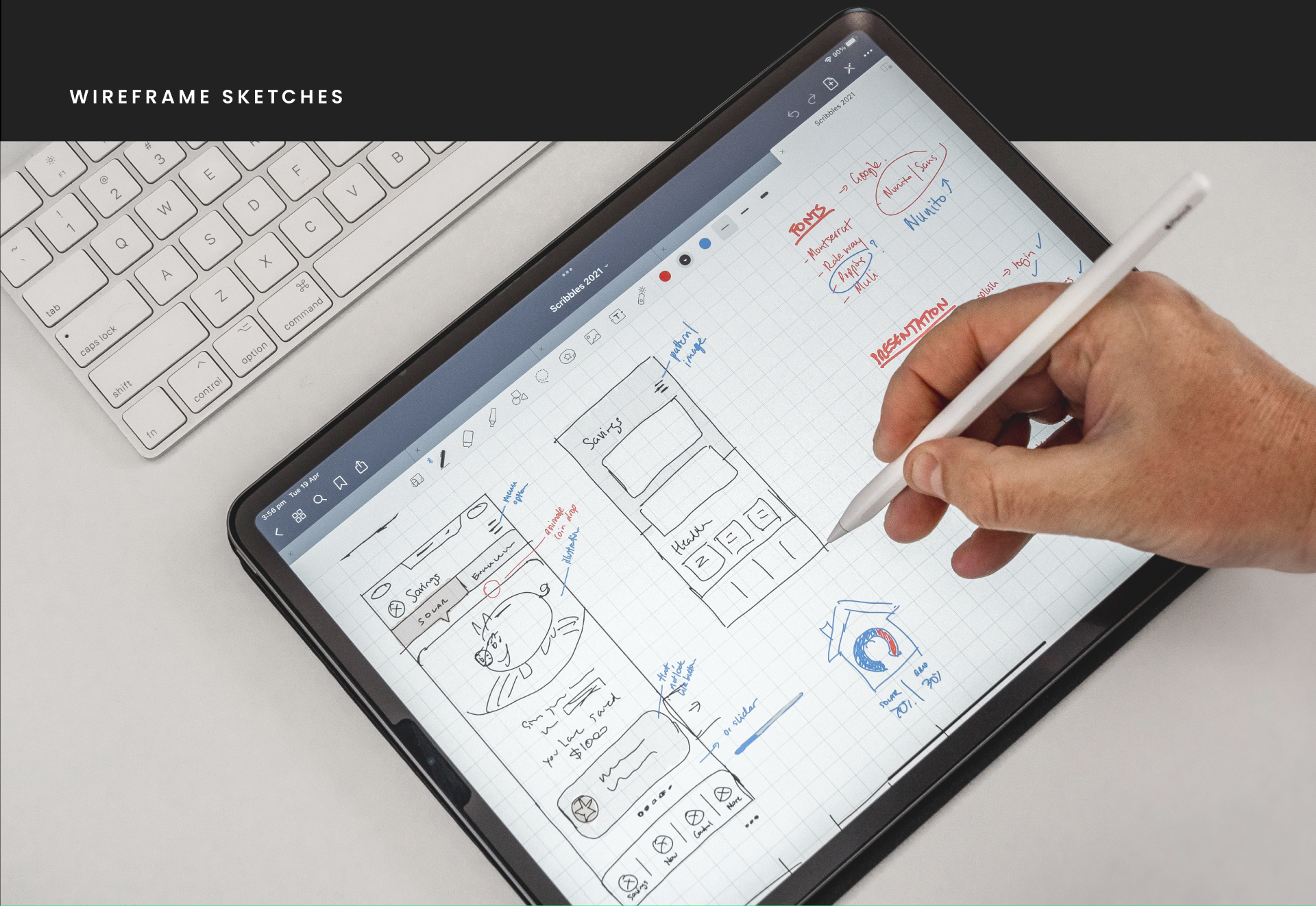
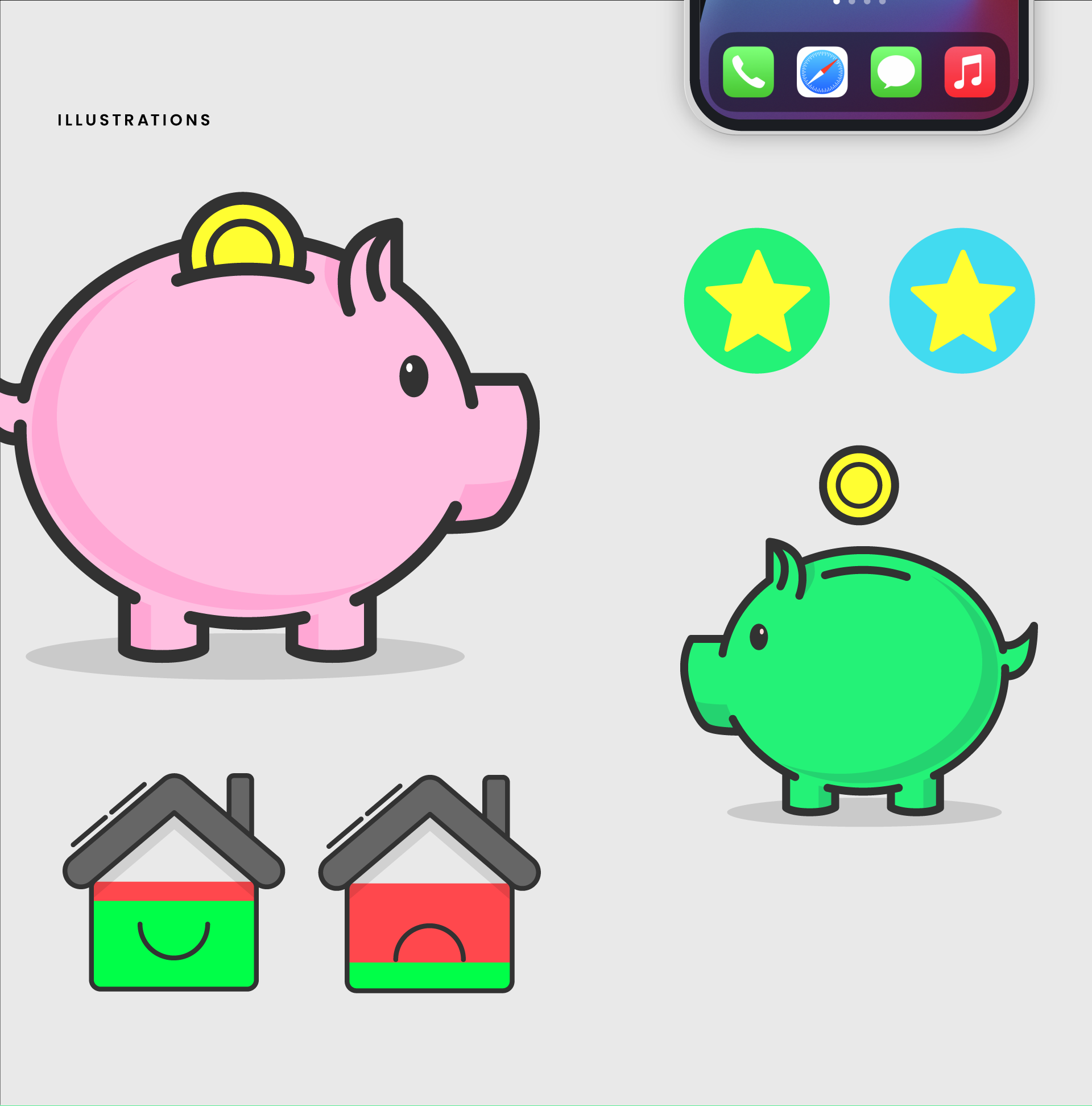
The initial stages involved planning and generating ideas, starting by putting pen to paper (well, iPad). Traditionally, data from energy apps is made up of dull numbers and stats, however, a fun and friendly approach was taken using illustrations. Users can easily see the amount of money and energy they are saving through the unique artwork style, which would later carry on to the website itself.