Suburban Building Services approached us with a desire to attract larger-scale clients and projects.
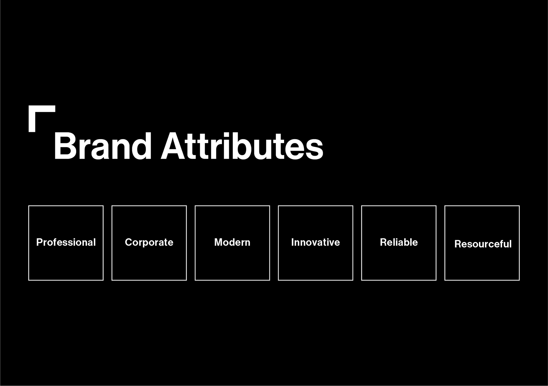
The task was set to modernise their tired old brand and create a new identity that depicted a more modern, professional and corporate image.

The Mission
Listening to the client’s needs, a game plan was formed to develop a new identity that would aim to attract larger-scale commercial projects and higher-profile clients.
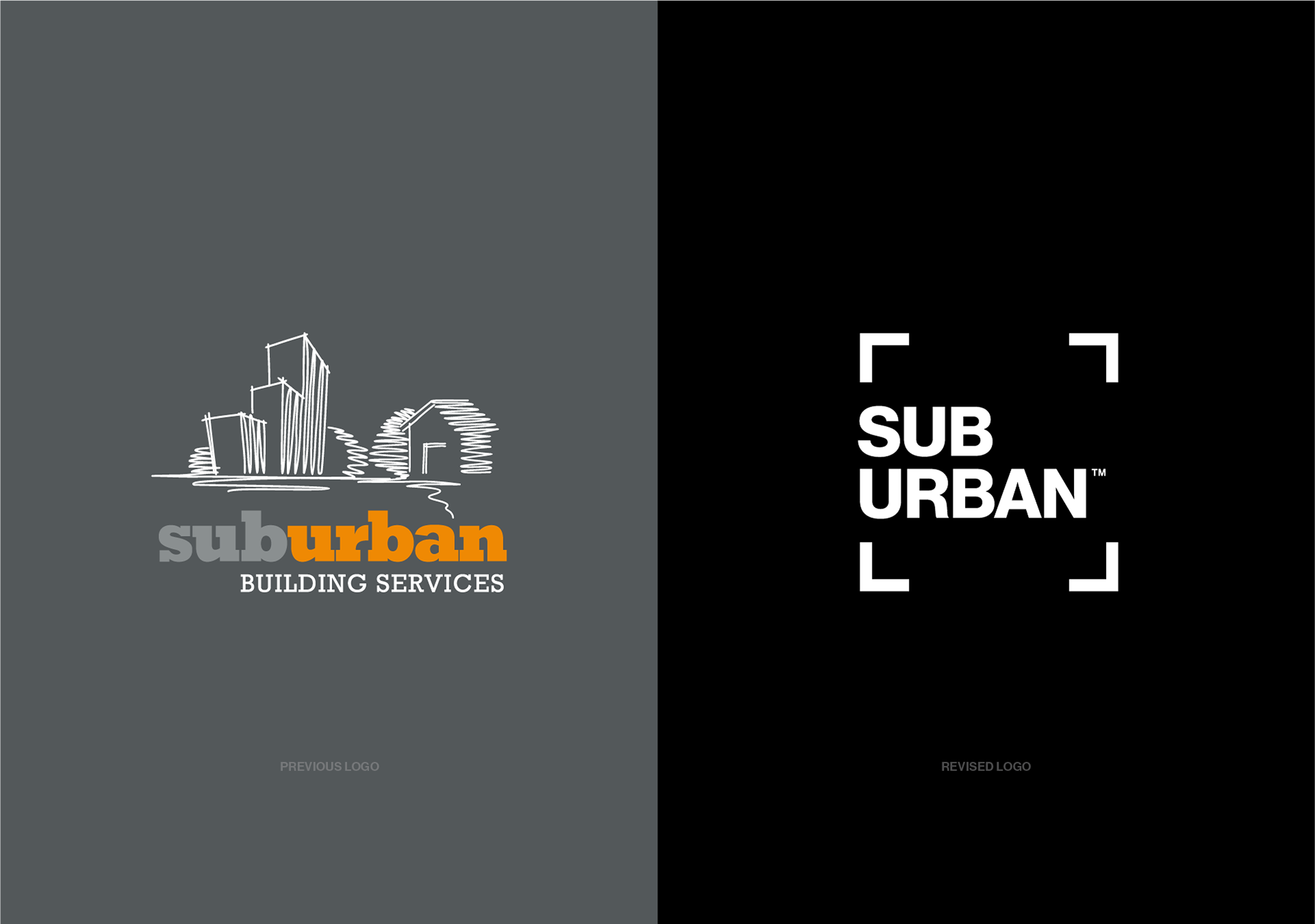
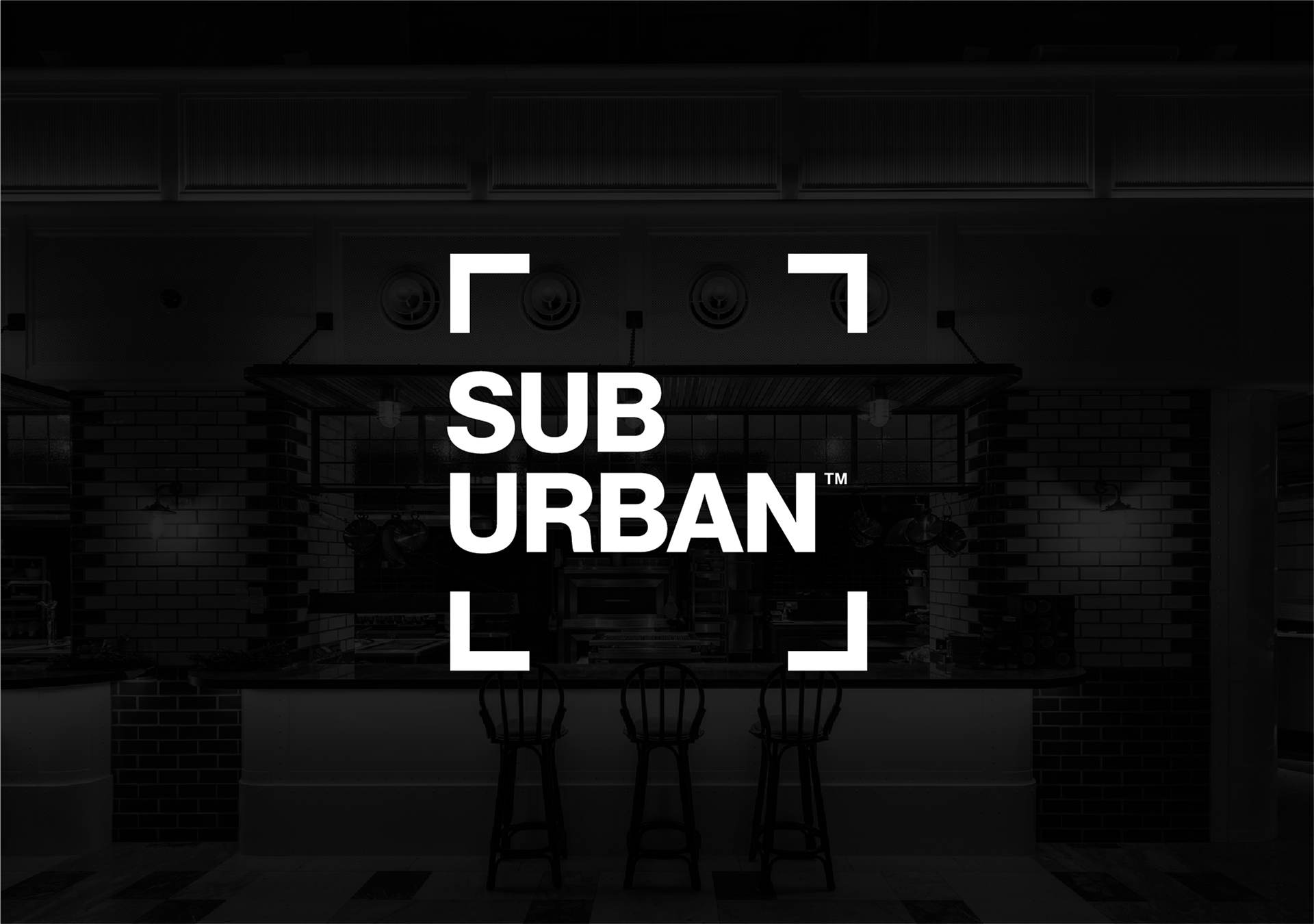
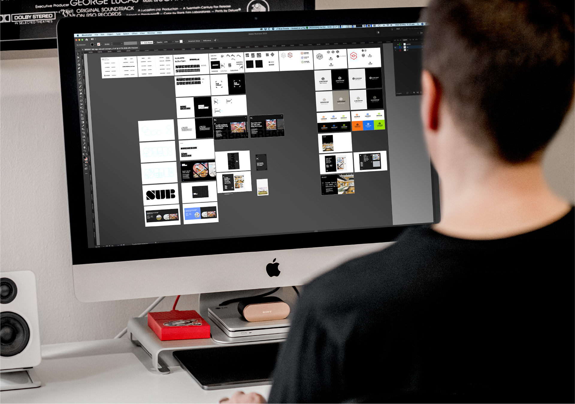
Initial competitor and industry analysis defined a clear path of differentiation to guide the creative direction. Although, not comfortable initially, a company name tweak was suggested – by shortening the long-winded ‘Suburban Building Services’ to simply ‘Suburban’.
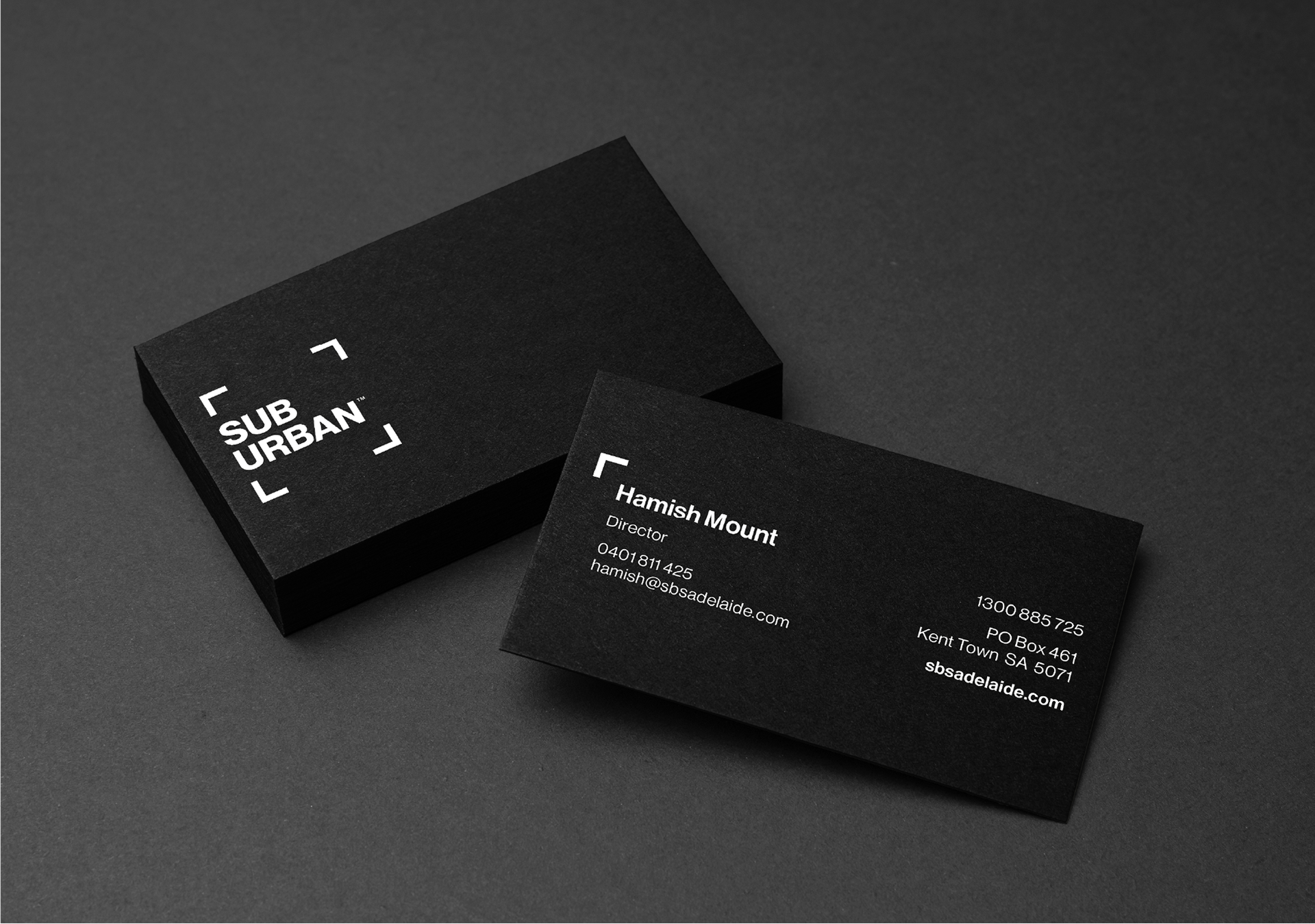
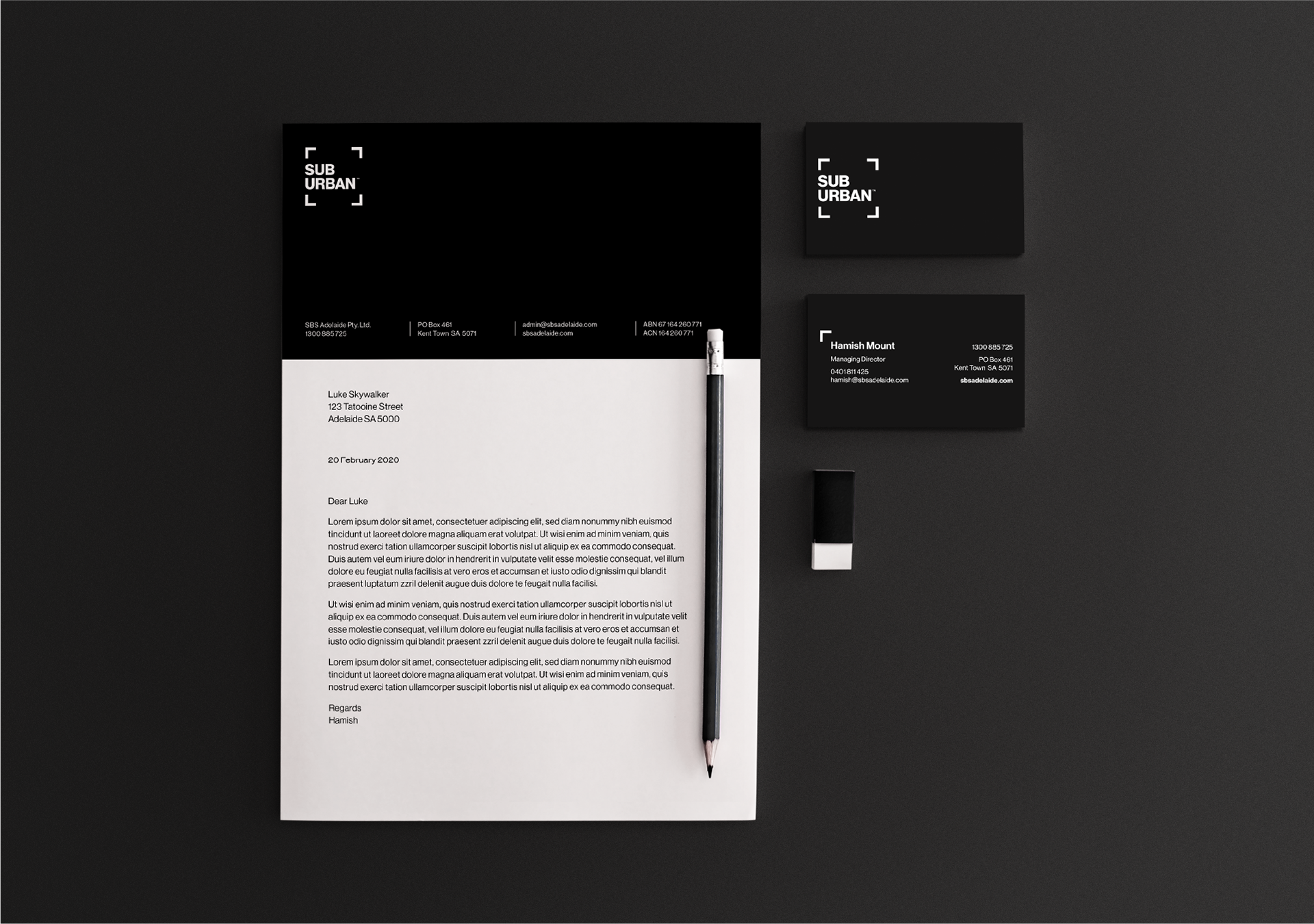
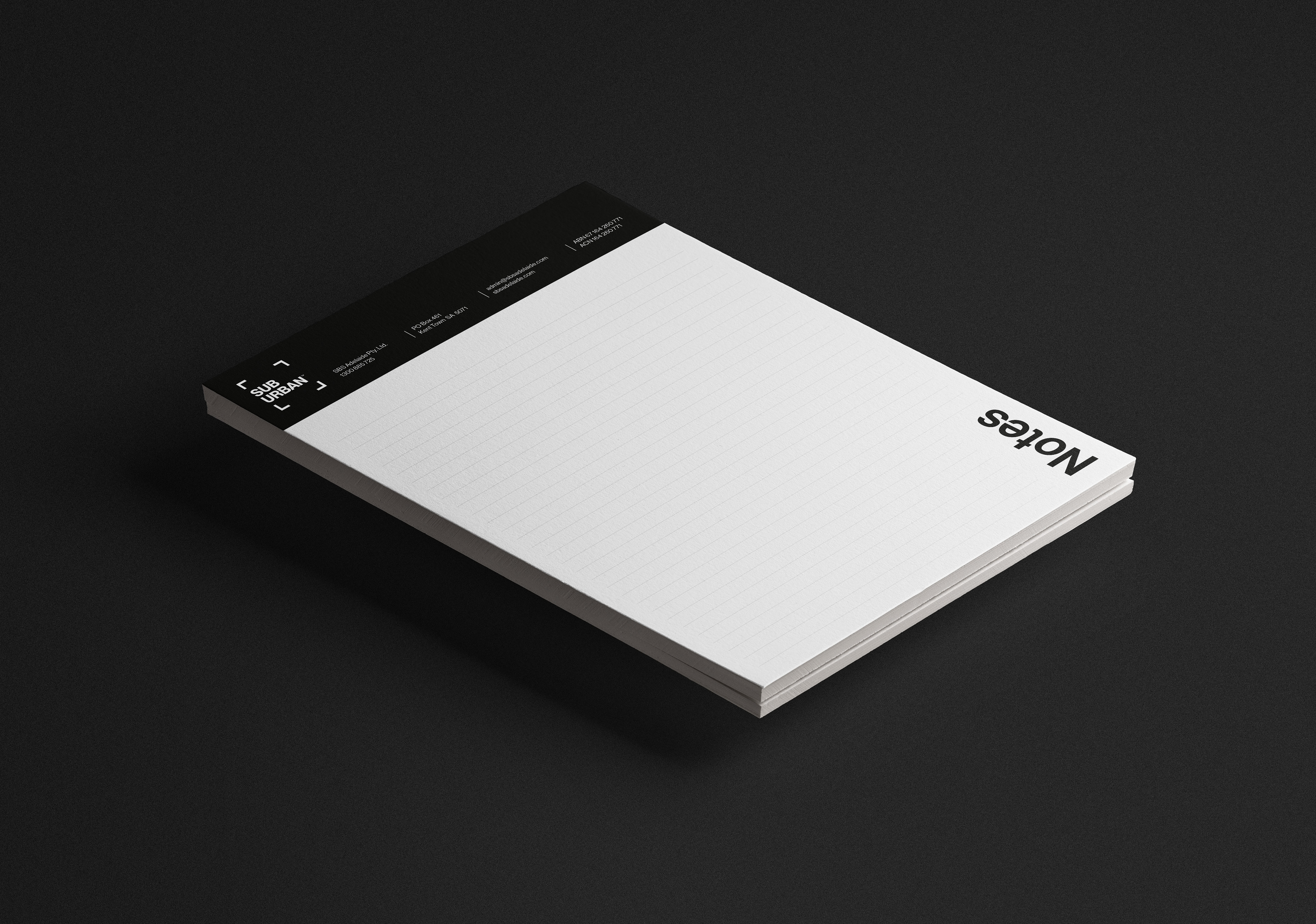
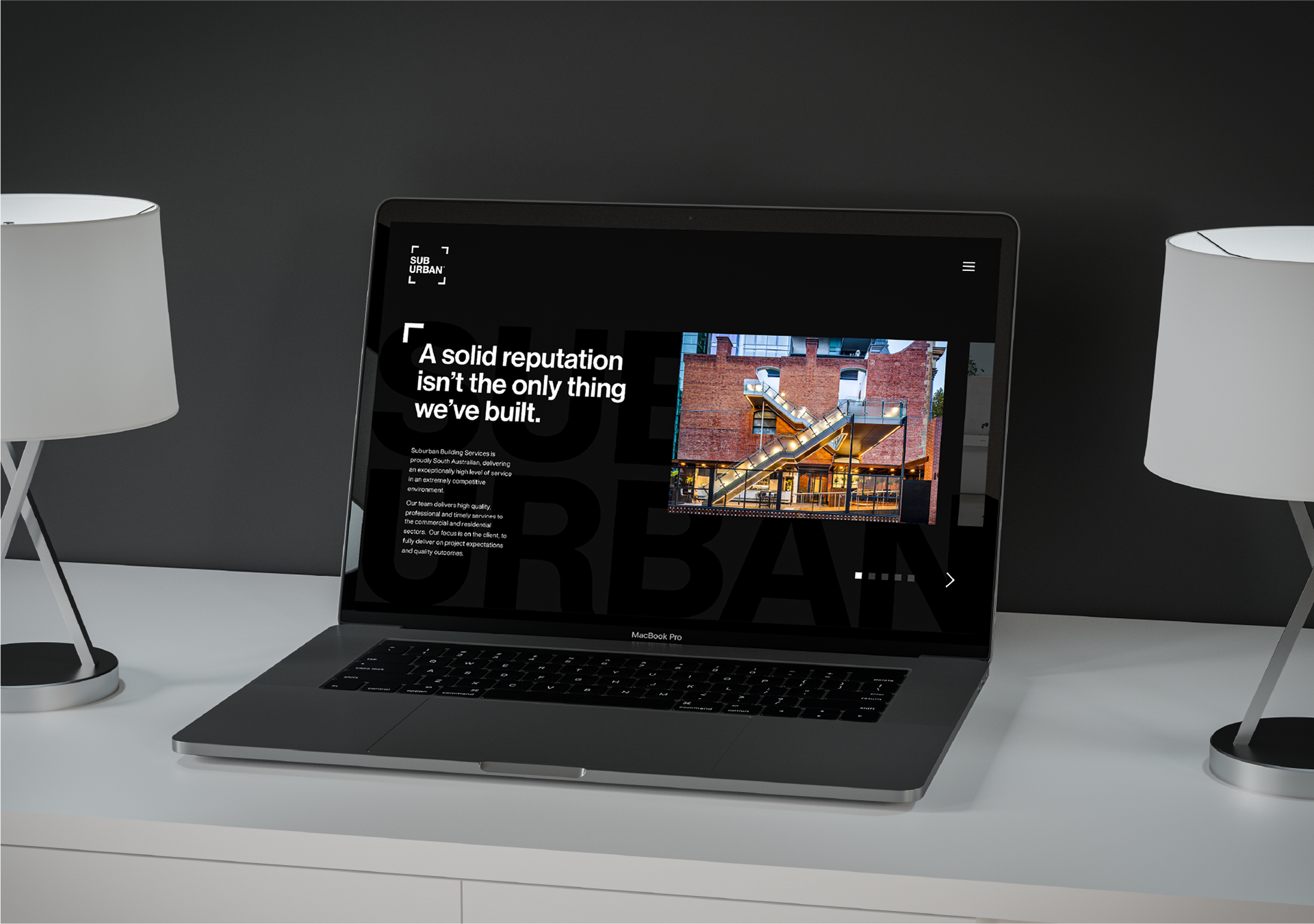
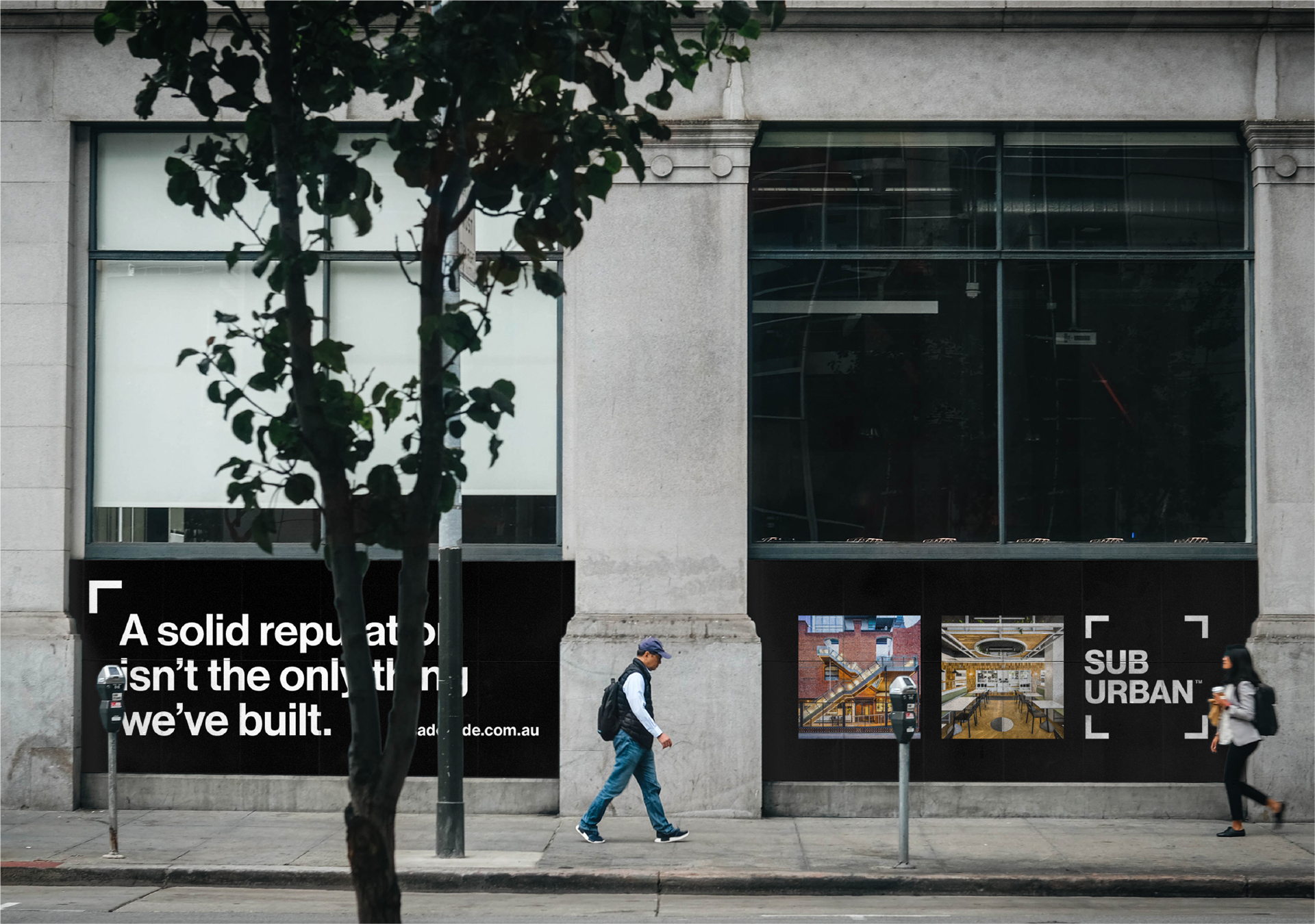
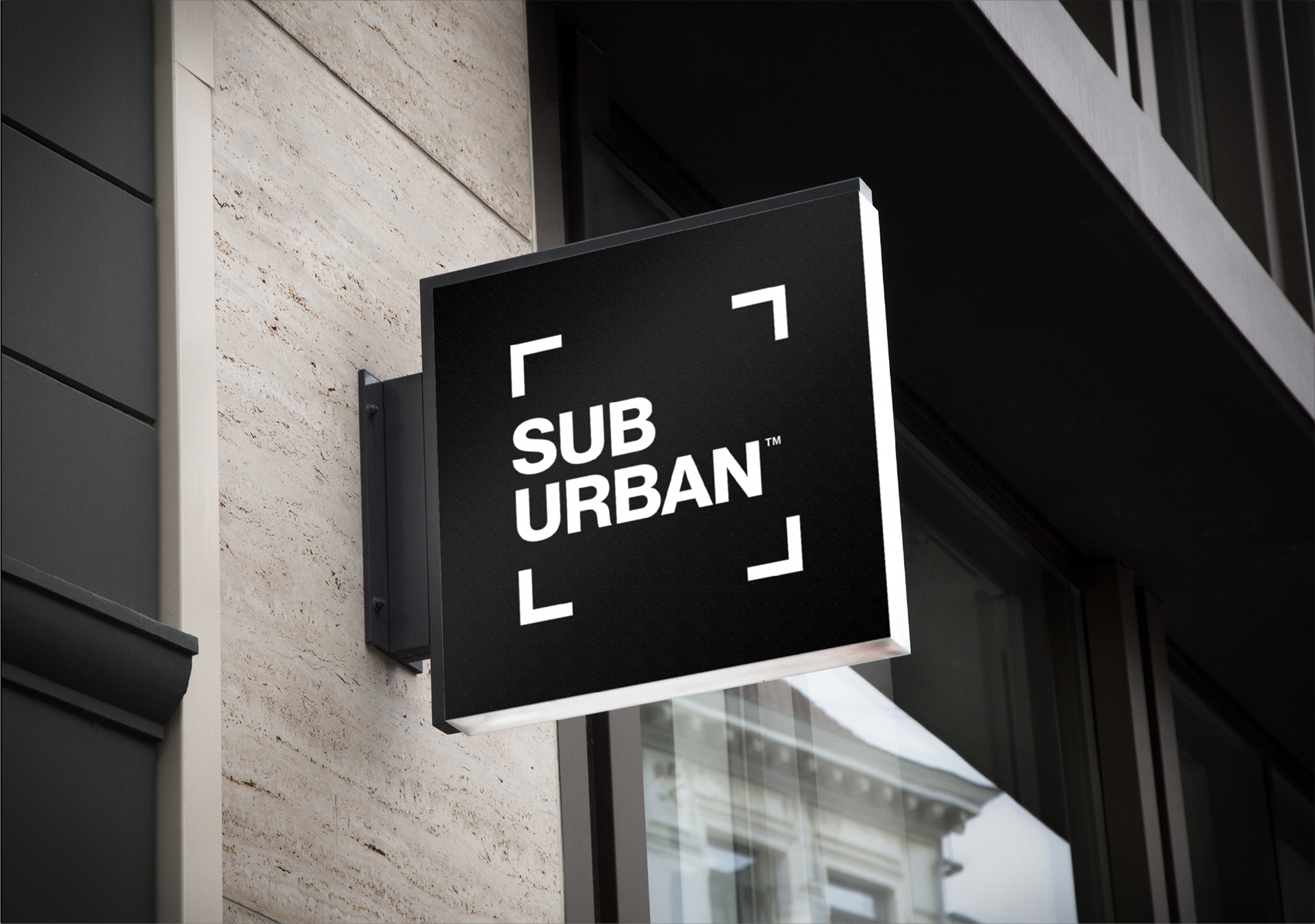
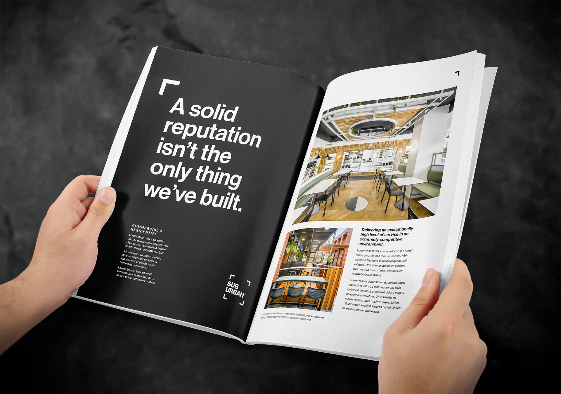
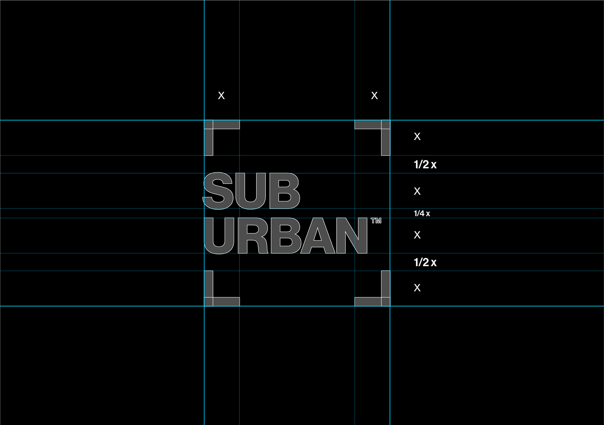
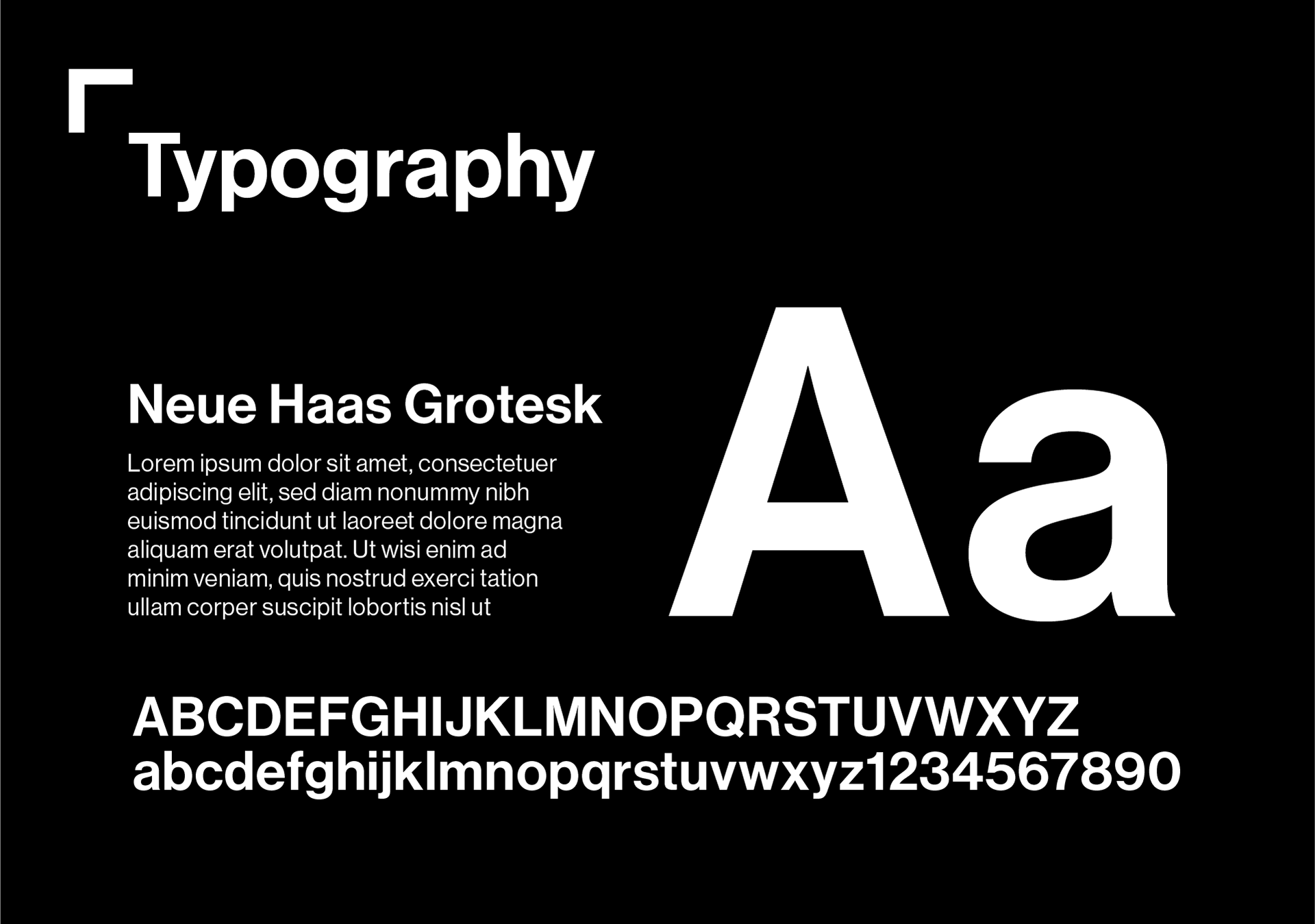
A minimal and clean creative direction was established, employing a classic black and white colour palette, and introducing splashes of colour via photography. A grotesque typeface was chosen to support the simple mark, which uses corner marks derived from the building plans themselves.
The Outcome
The new brand identity has lead to an increase in brand awareness with great deal of positive feedback from clients and the marketplace. Despite the pandemic, Suburban have never been so busy and their future is looking very bright.