Building a brand that brings data and people together.
WBDM needed a brand identity that clearly reflected its role as a leader in enterprise data management while focusing on human-centred, values-driven solutions. The goal was to create a visual identity that directly connected to WBDM’s philosophy of building effective data networks where human interactions drive technological outcomes.
The identity had to establish essential branding elements that position WBDM as a premium provider in a complex, evolving industry, stand out in a competitive market and foster meaningful connections with clients seeking innovative solutions.
Project scope
// Brand identity discovery workshop and document
// Stylescapes
// Logo design
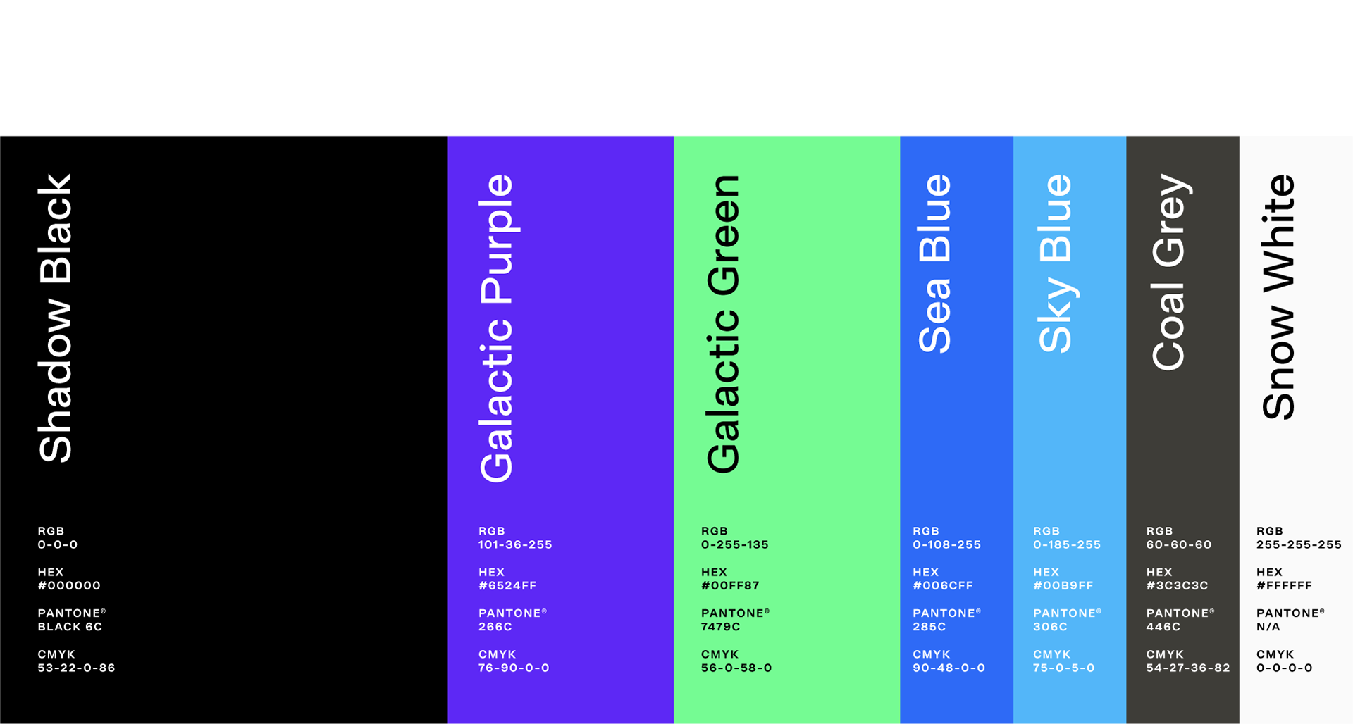
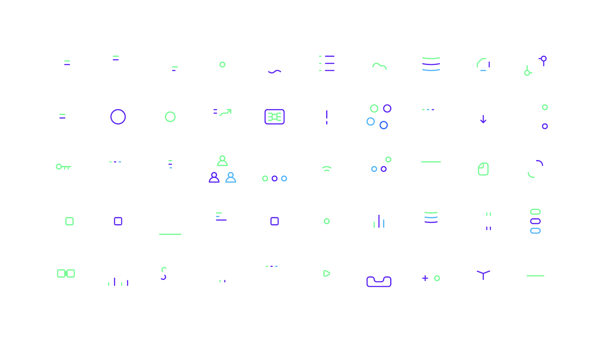
// Visual identity
// Presentation template
// Website design assets
The Process
Our journey with WBDM began with a deep dive into their brand through an in-depth discovery session. This workshop provided the foundation for their brand identity, ensuring every design decision aligned with their business goals and customer needs.
Brand insight
We explored WBDM’s mission (the “why”), their approach to enterprise data management (the “how”), and the services they provide (the “what”). From there, we defined key brand attributes, including voice and tone, visual style, and the unique factors that set WBDM apart from their competitors.
User profiles
Understanding WBDM’s clients was crucial in shaping the brand. We created detailed user personas, exploring their roles, challenges, and needs. By incorporating these insights, we ensured the brand identity would connect with the people who depend on WBDM’s expertise.
Business goals
A strong brand is built with purpose. We examined WBDM’s industry positioning, how customers discover and engage with their services, and what drives brand awareness and revenue. This strategic alignment ensured that the identity would not only look great but also support business growth.
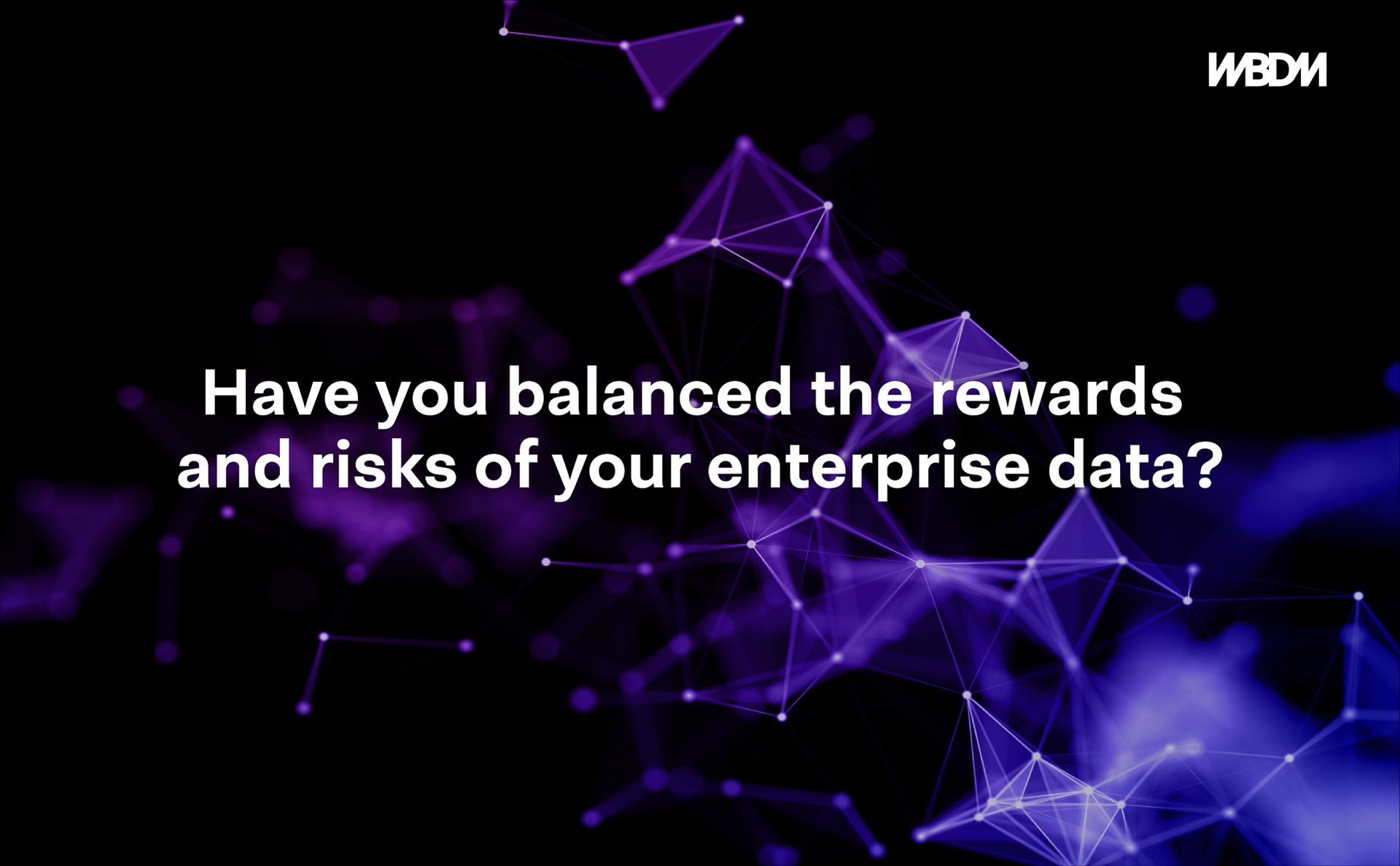
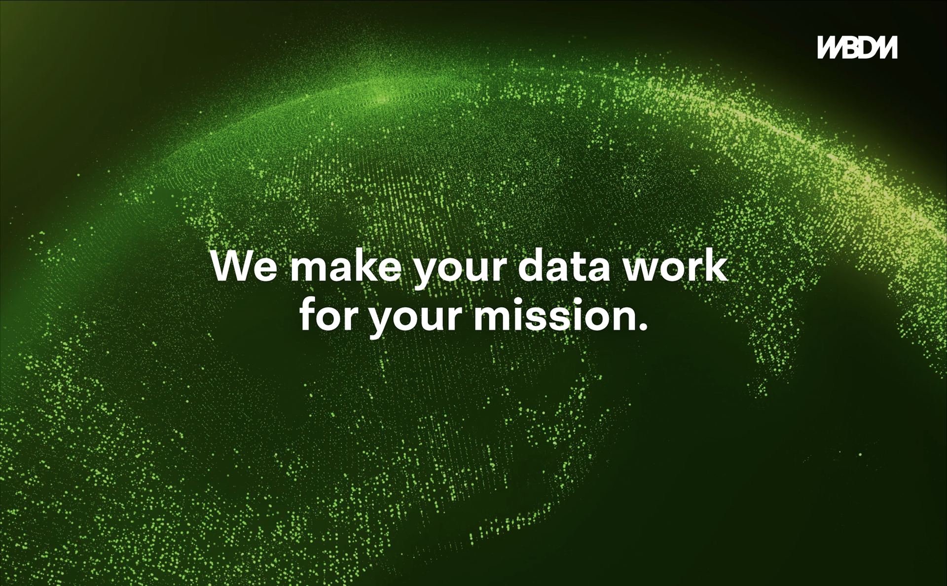
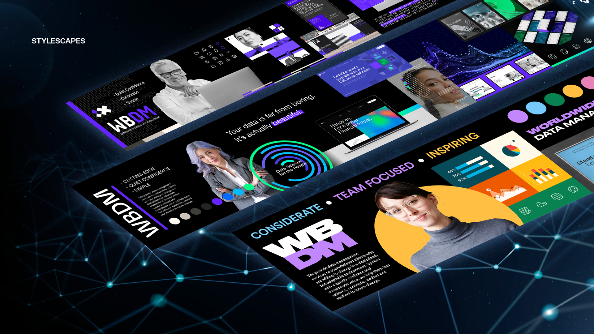
Stylescapes: Defining the creative direction
After the discovery workshop, we transitioned into the visual space. Stylescapes are a quick and effective way to define WBDM’s brand voice, tone, and aesthetic. Built from a carefully curated collection of images, they provided a high-fidelity preview of the design direction before any final decisions were made.
We presented WBDM with three distinct stylescapes—ranging from ‘mild’ to ‘spicy’. This essential phase allowed WBDM to collaborate early on in the process, refining and shaping the visual identity to ensure it truly resonated with their audience.
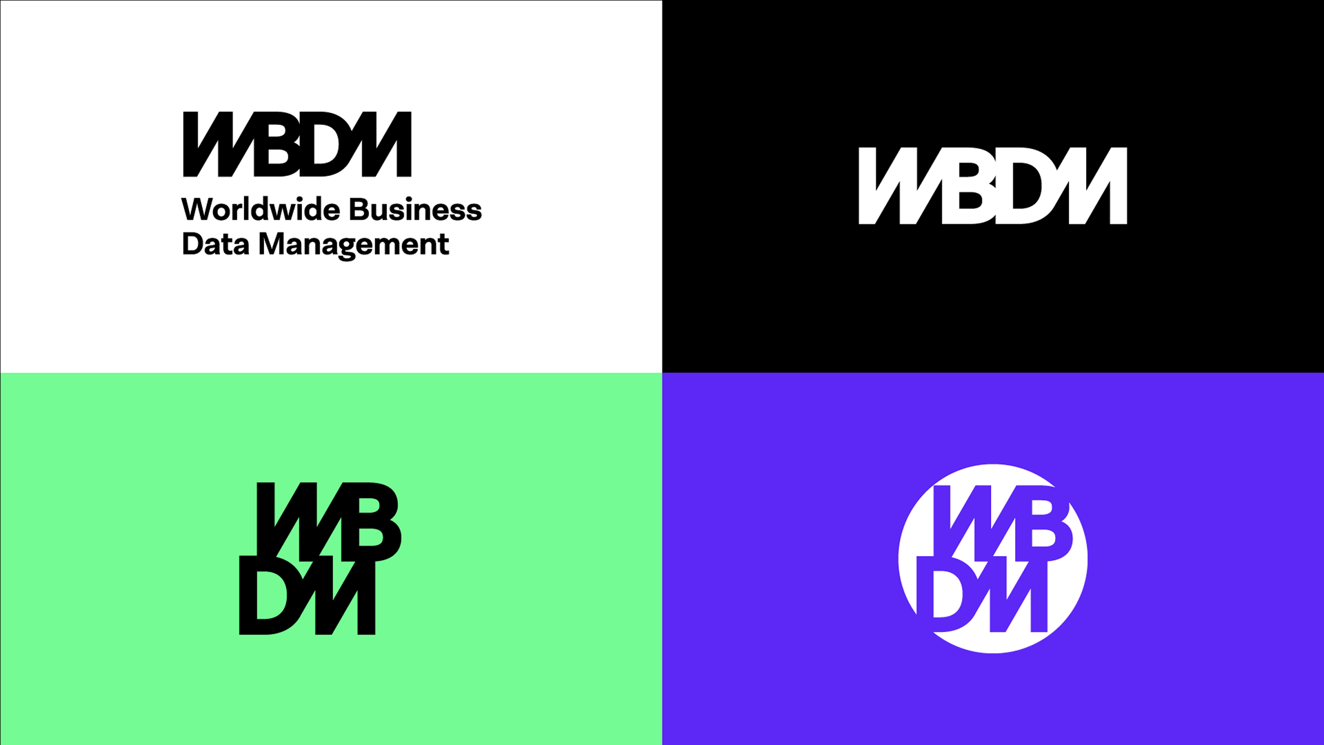
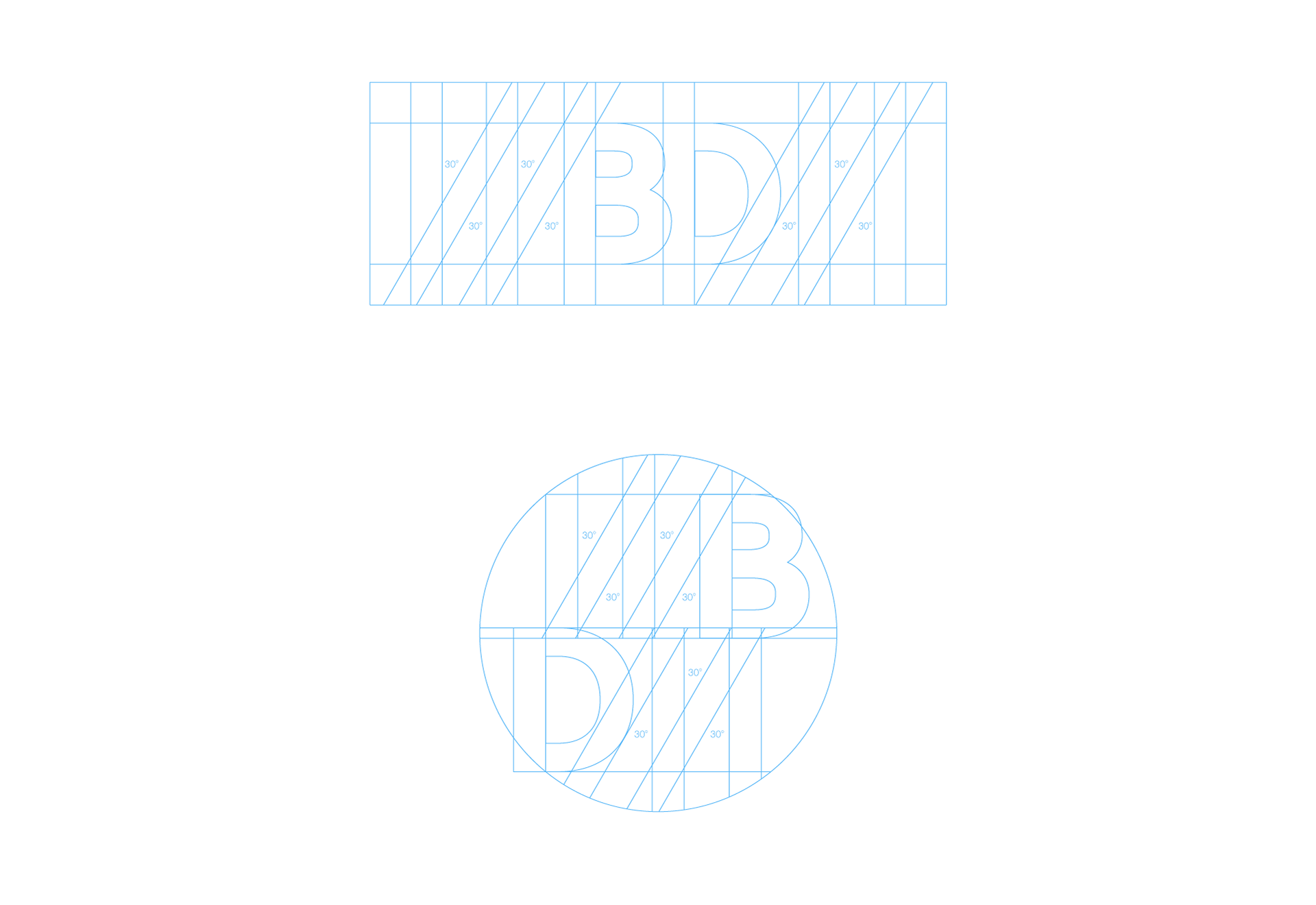
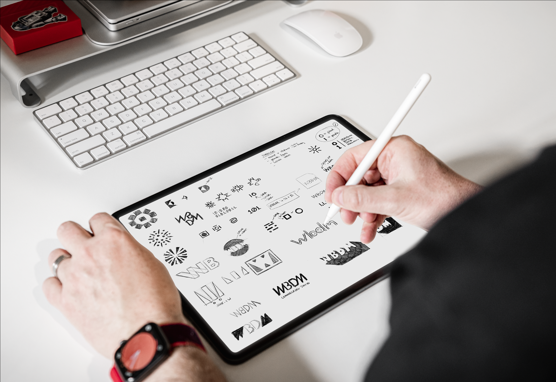
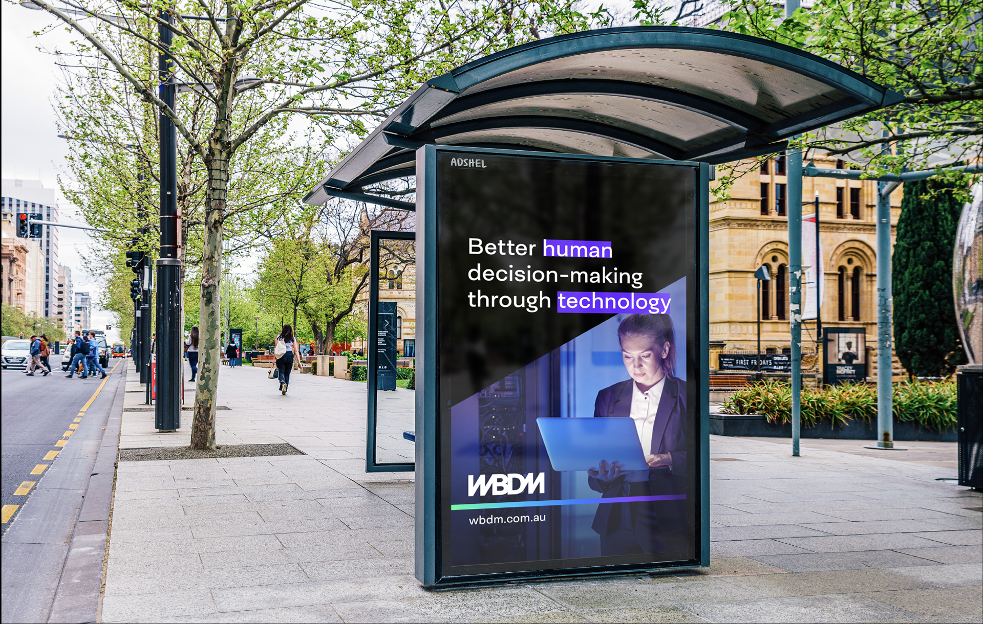
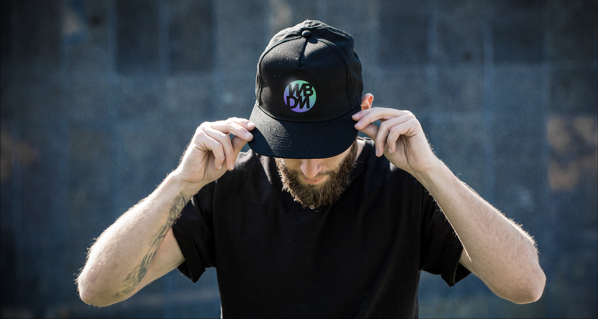
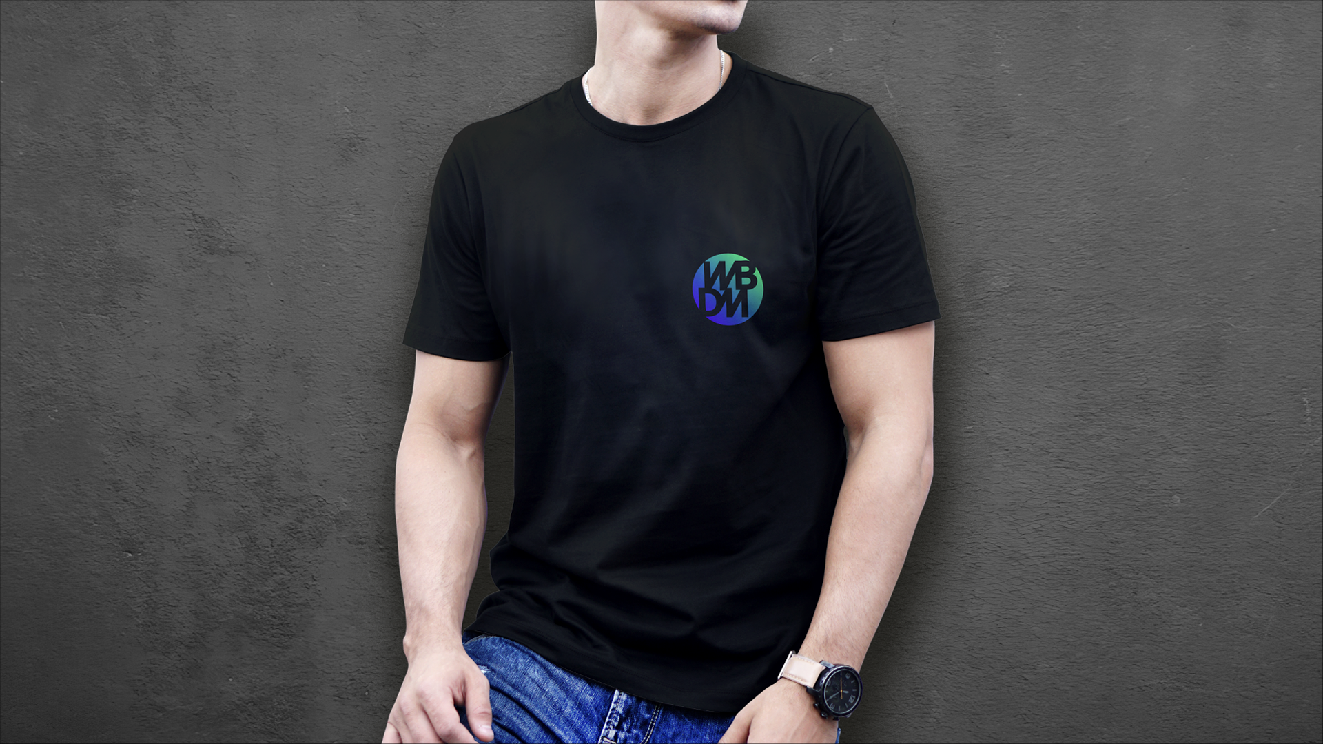
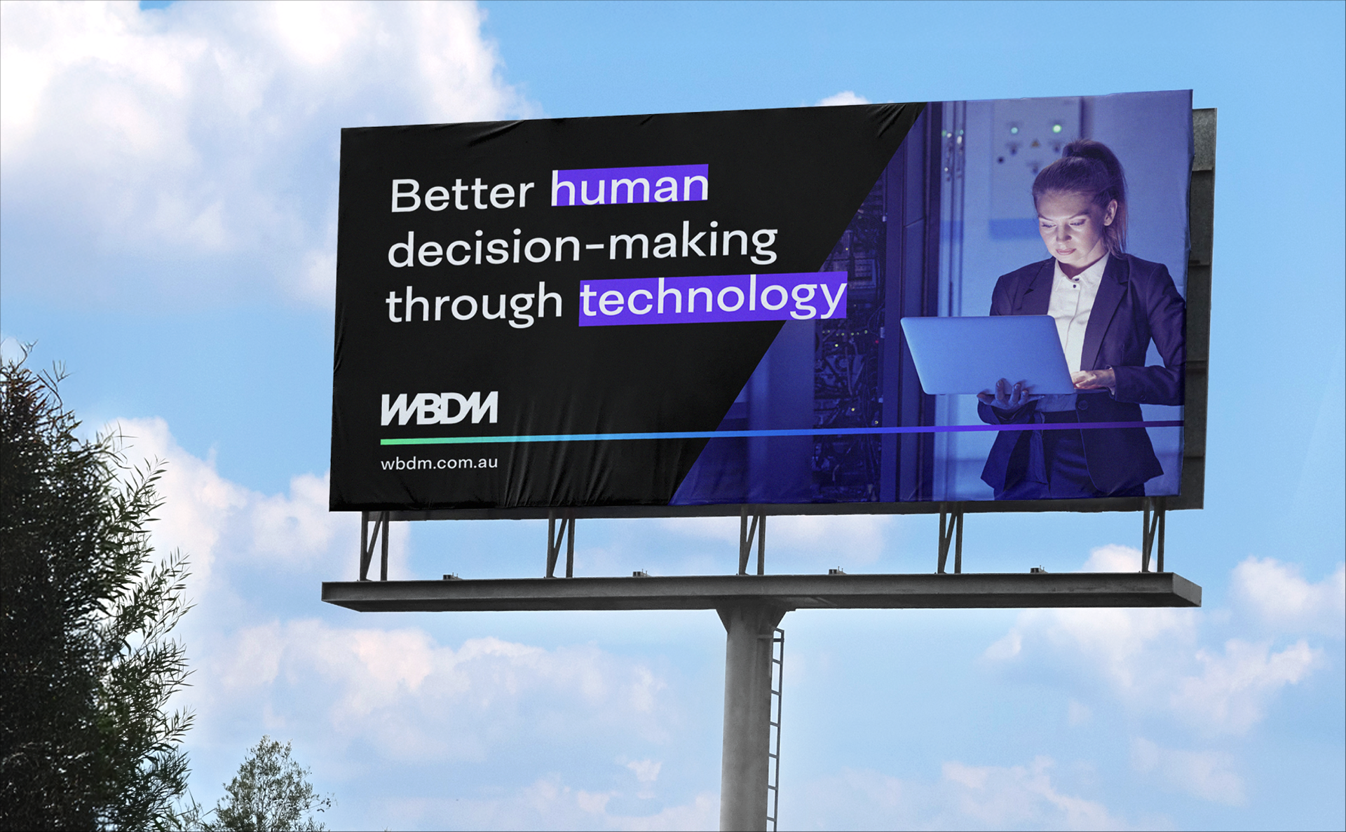
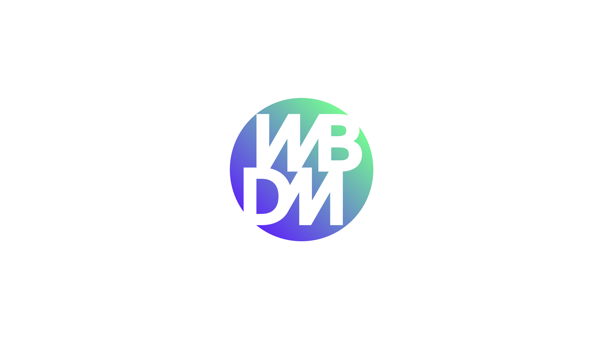
Logo concepts and visual identity
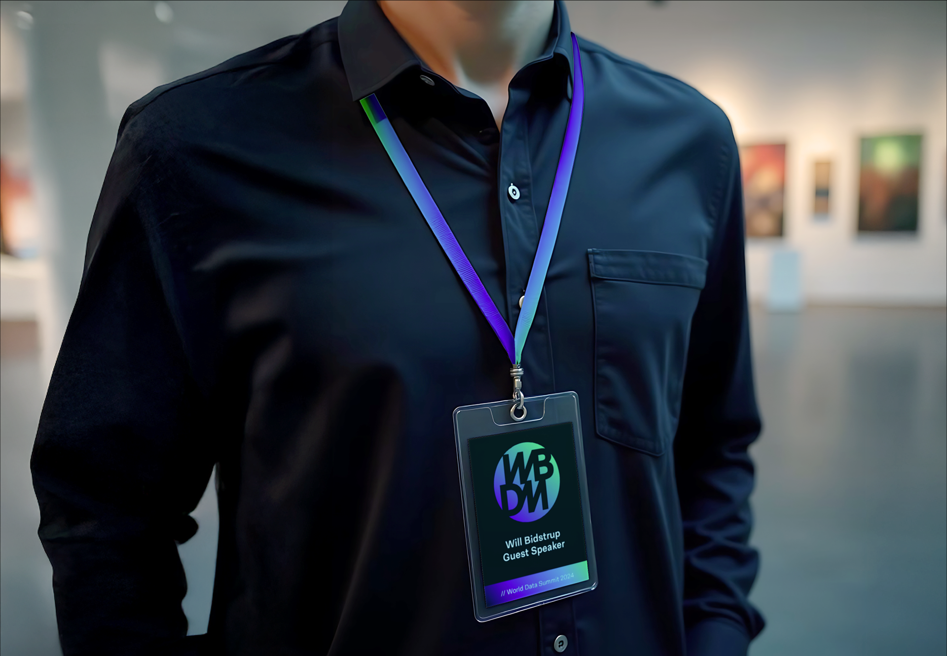
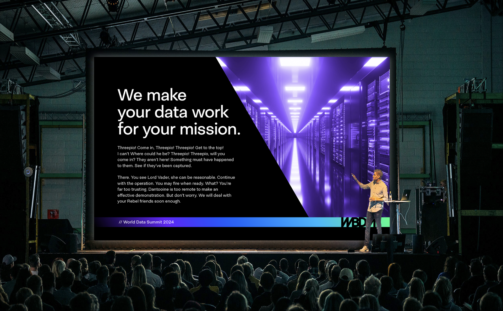
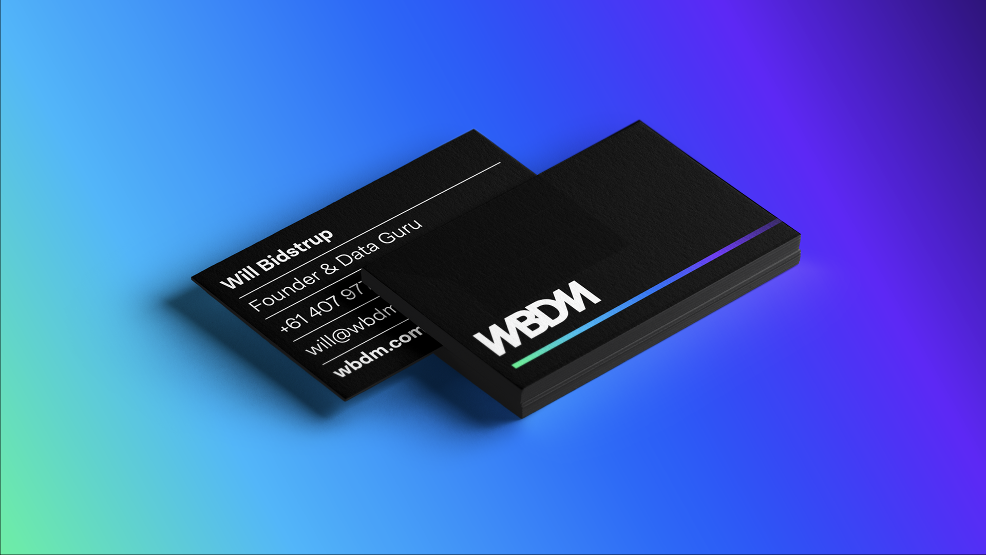
We presented WBDM with three distinct logo concept directions, each reflecting different aspects of their brand. To help them visualise the impact, we showcased each concept through real-world photo mockups, allowing WBDM to see how the brand could look across various applications, such as on websites, business cards and advertising.
This collaborative approach ensured the final logo not only reflected WBDM’s core identity but also made a lasting and meaningful impression in the marketplace.