Challenge
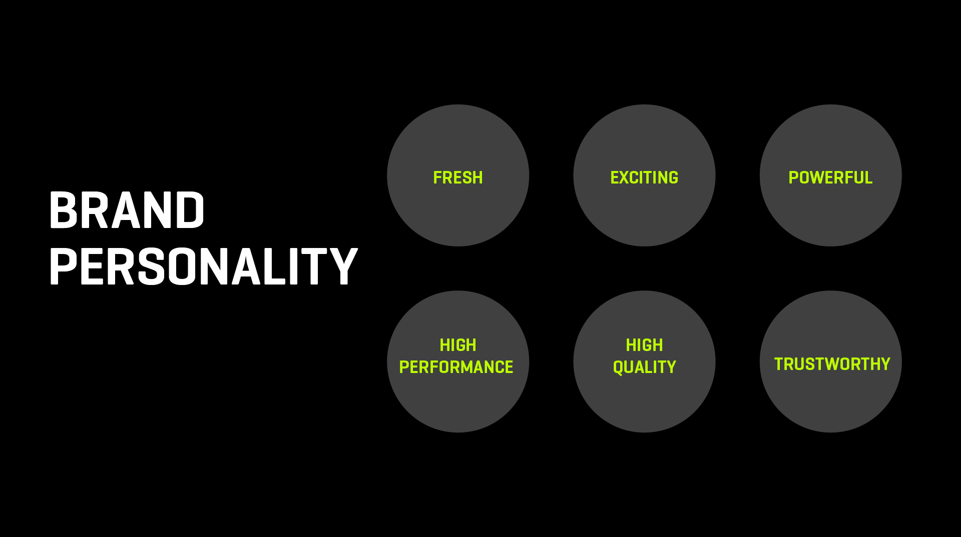
The goal was to build a new visual identity for NBFA which positioned them as a high-performance, quality football coaching academy. The identity had to attract the attention of 7 to 14 year-olds and their parents – so it needed to be fresh, exciting, energetic and powerful.

Approach
When we look at other existing global sports brands, such as Nike, Adidas and Reebok, we see simple and unique logomarks.
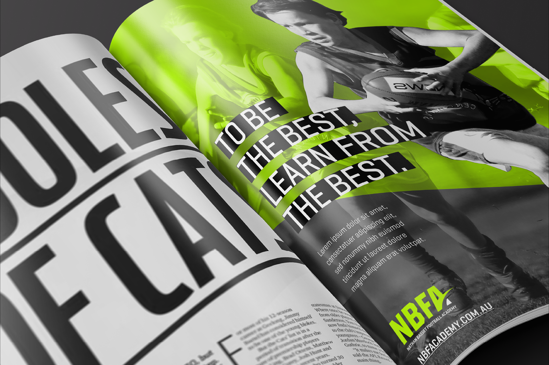
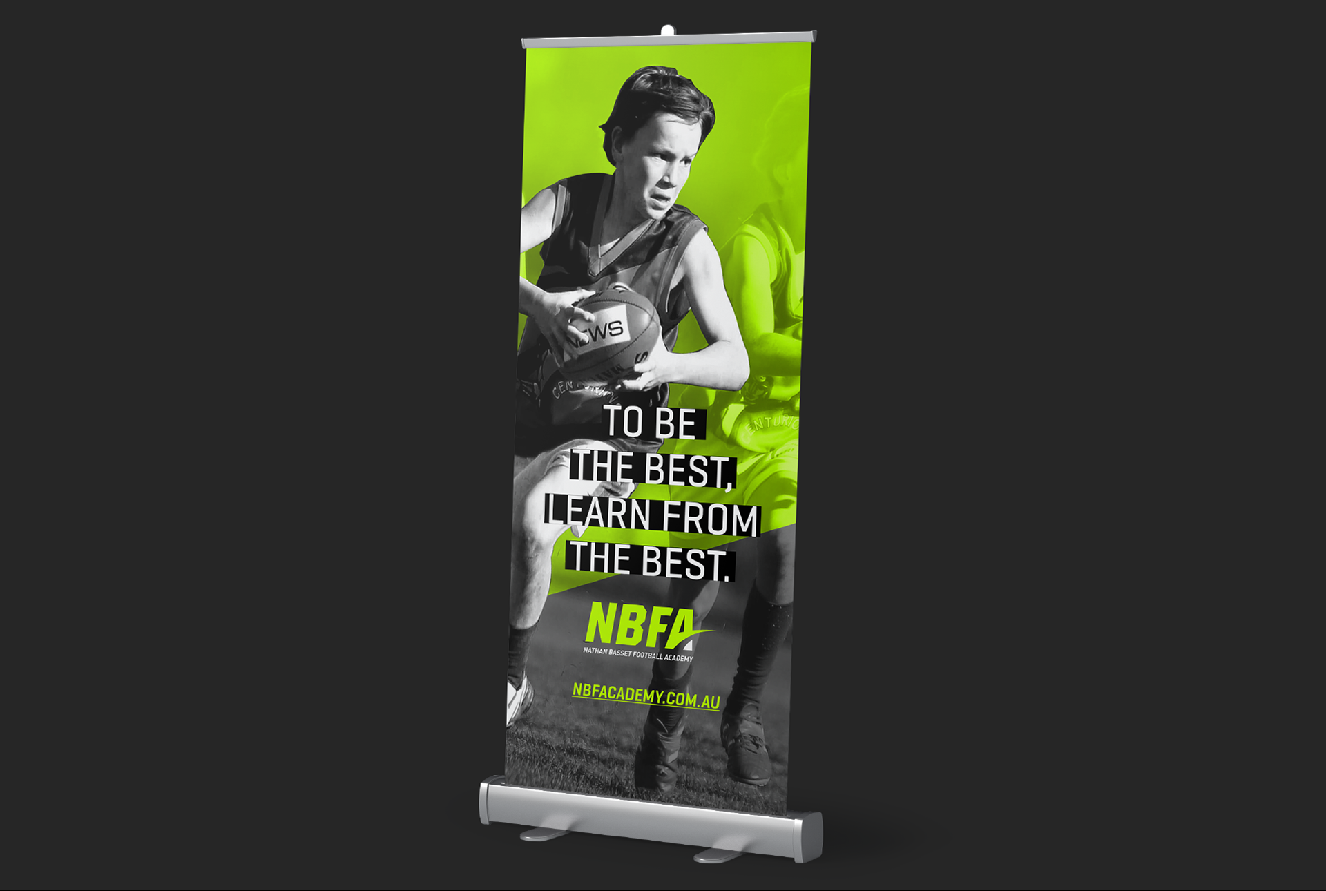
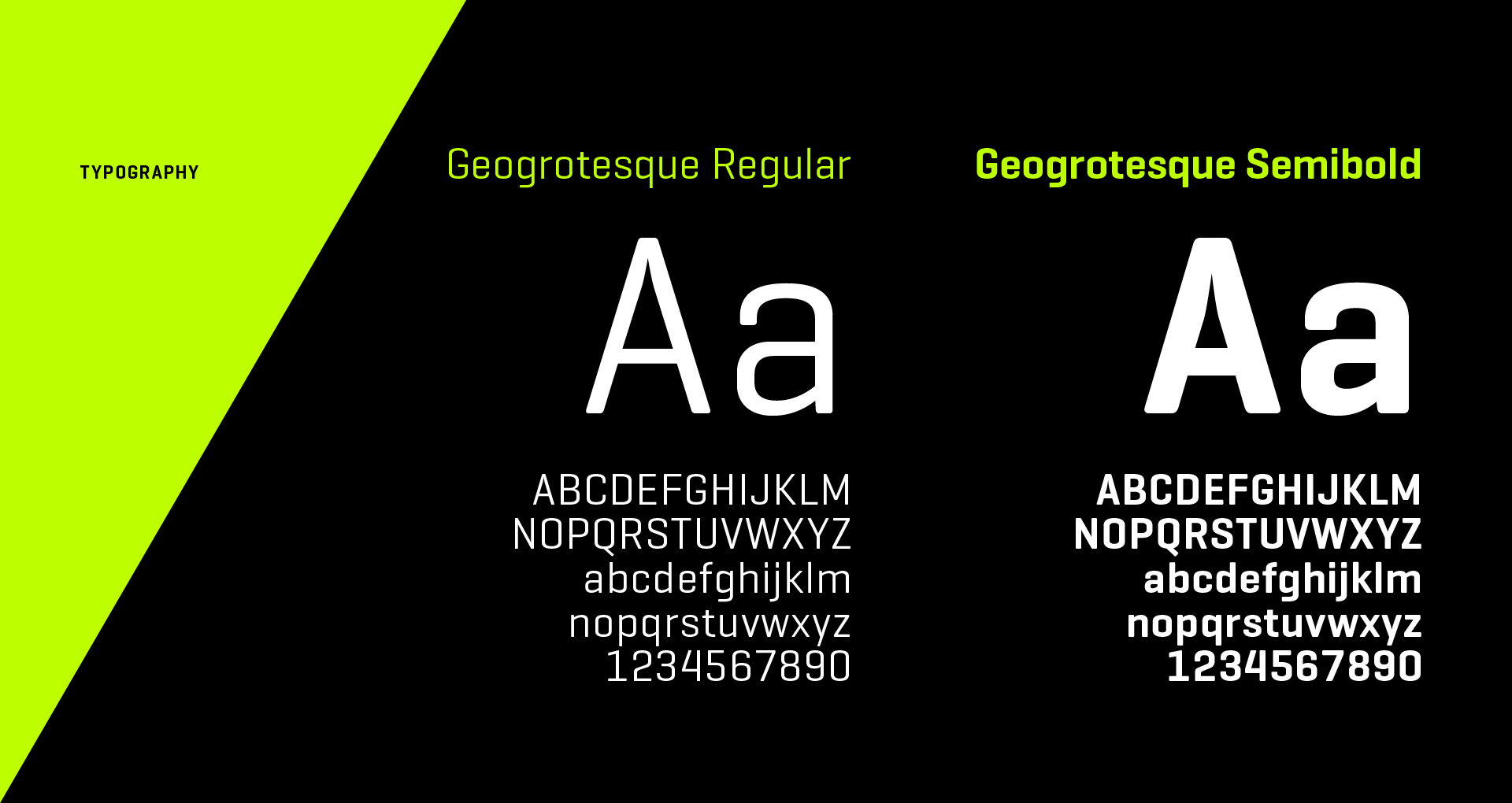
It is the graphic language used across print and digital mediums that compliments the logo portraying high performance and powerful qualities that assist in building the brand image.
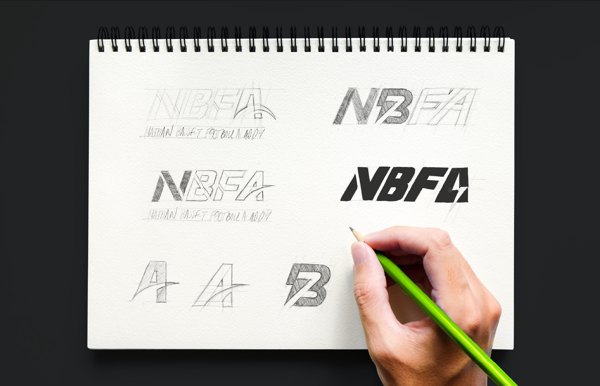
Solution
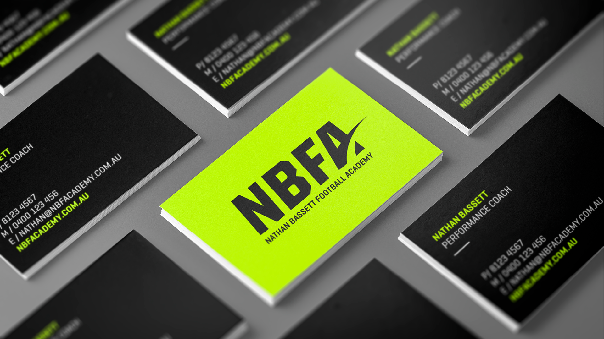
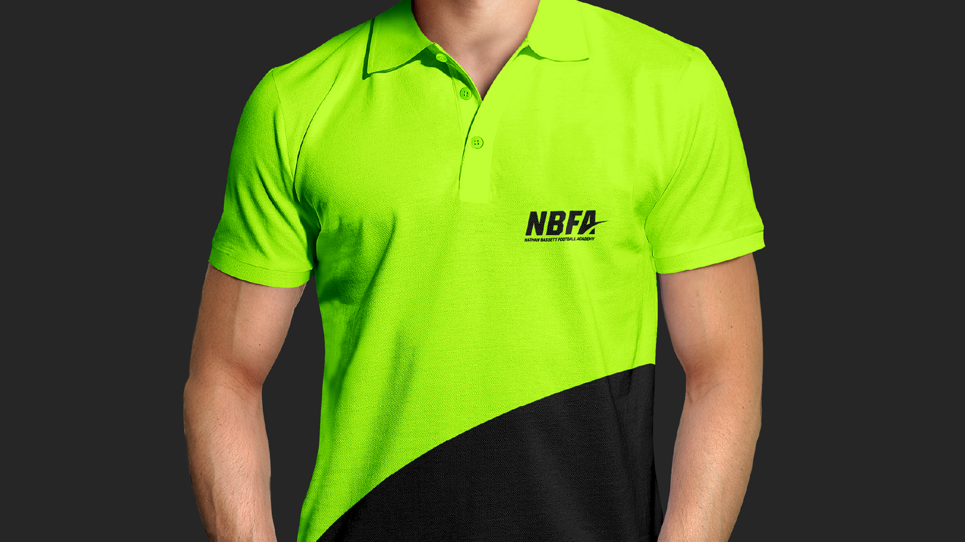
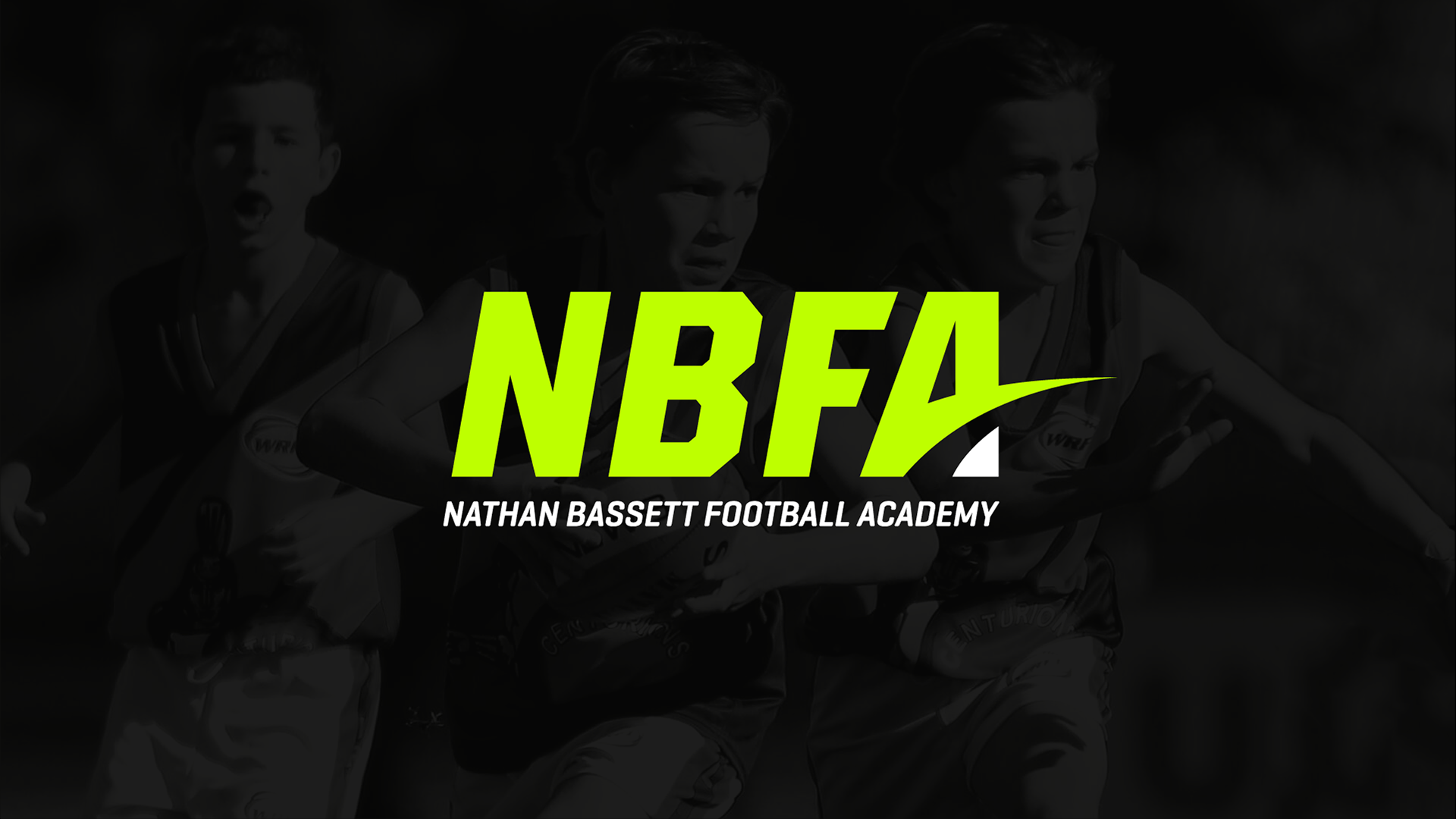
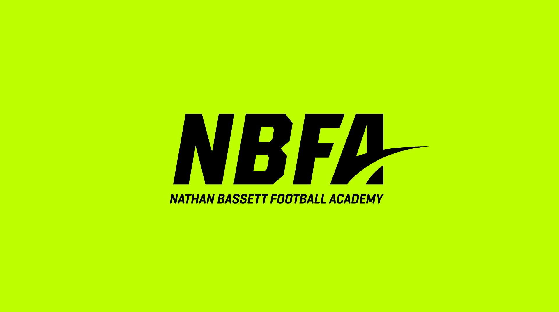
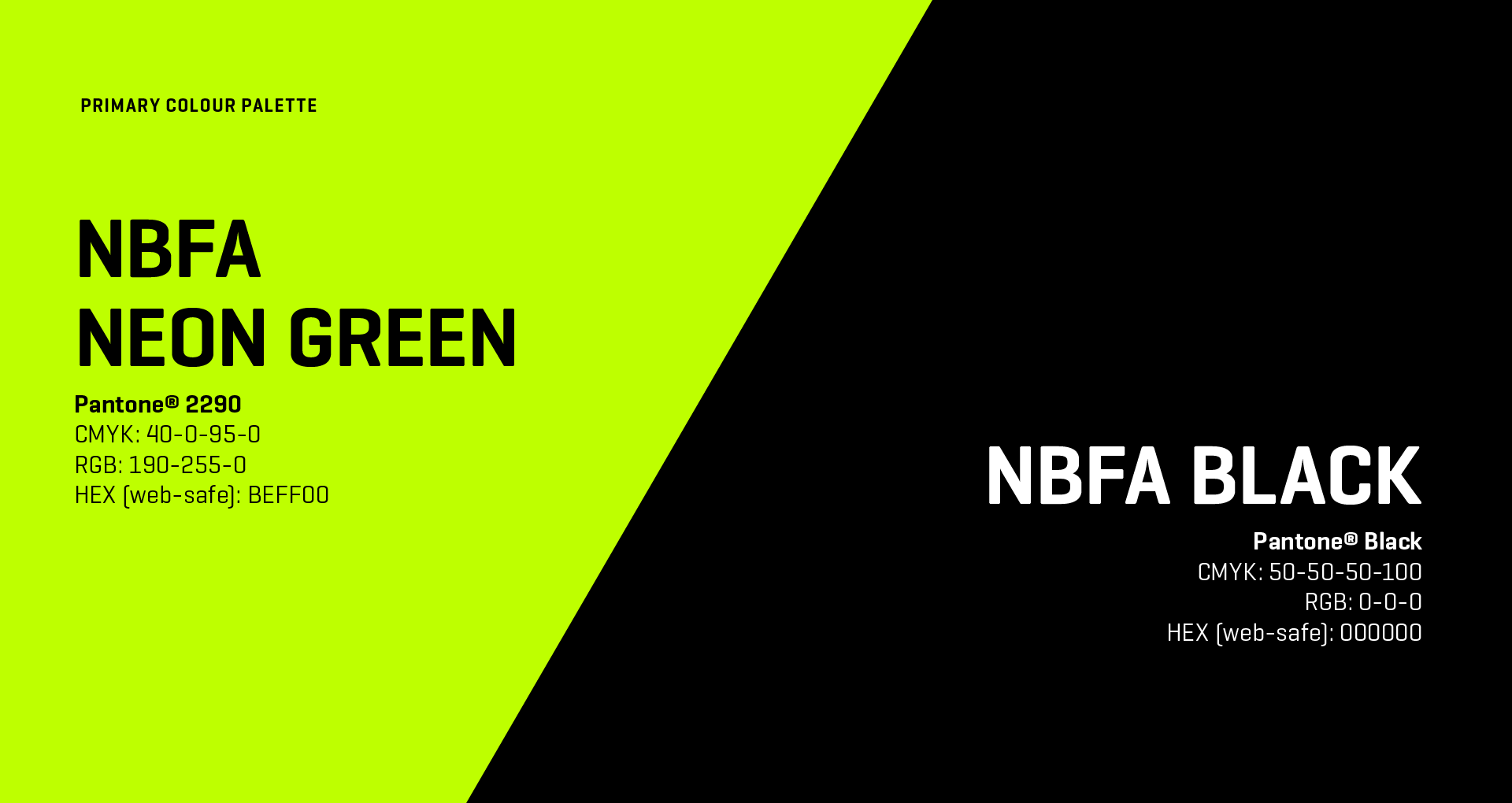
This logotype visually positions NBFA as a high-quality and professional sports brand. The typography style used to create this mark is modern, bold and powerful. A unique swoosh graphic element representing movement, direction, progress and the ‘road to success', has been incorporated into the ‘A’ letter form.
To intensify the energy and create maximum stand-out, a neon green colour has been used. This offset against the pure black creates a bold and powerful presence. This colour is best recreated using special Pantone® fluorescent print inks or in digital screen applications.