This was a two-part identity design project.
1 \ ABT logo
ABT is a company that develops high-quality, sealed brakes for off-road vehicle use in both the recreational and mining industries.
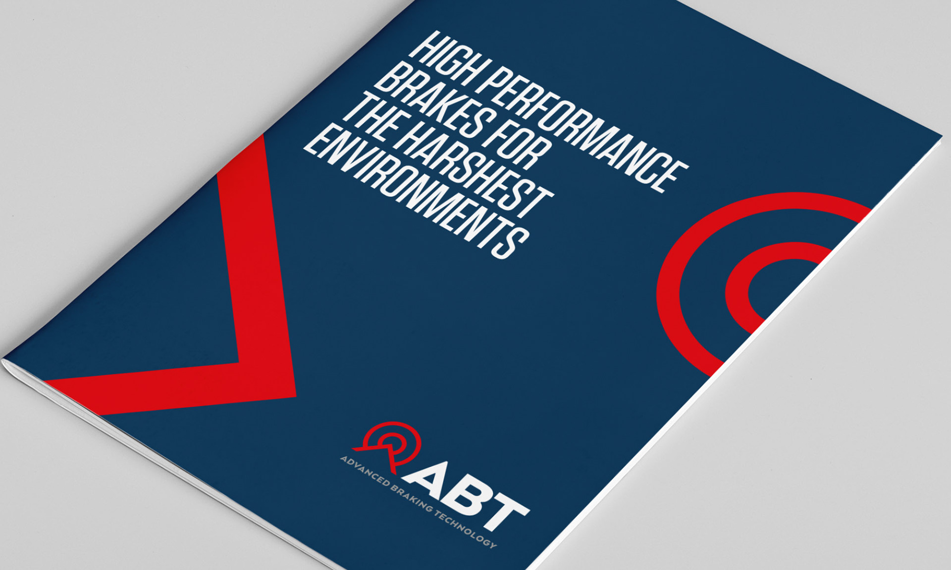
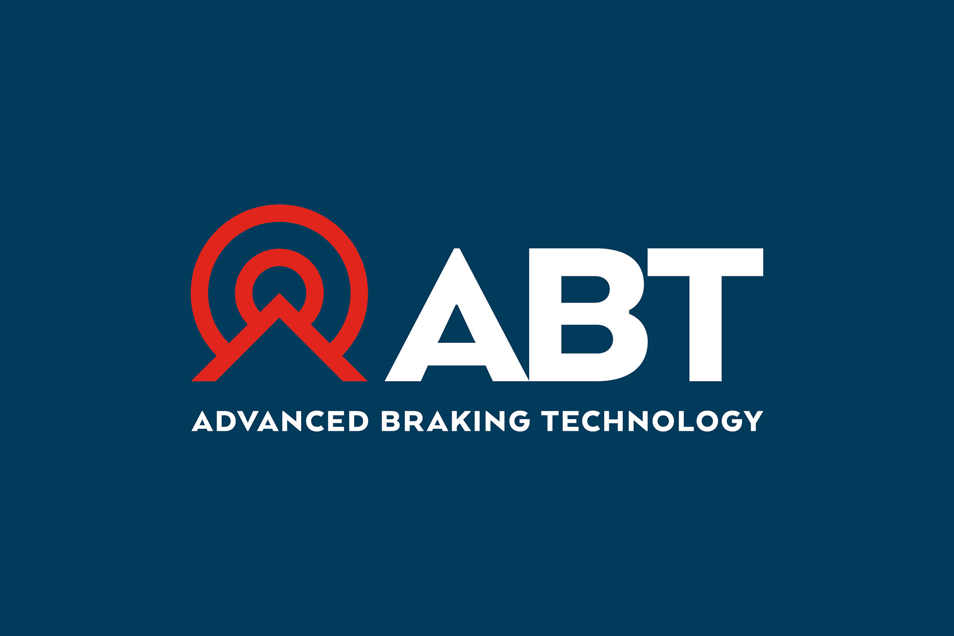
The goal was to develop a new visual identity for ABT and position them as the undisputed industry leader. The final logo had to convey ABT as a professional, reliable and innovative company that embraces new technologies.
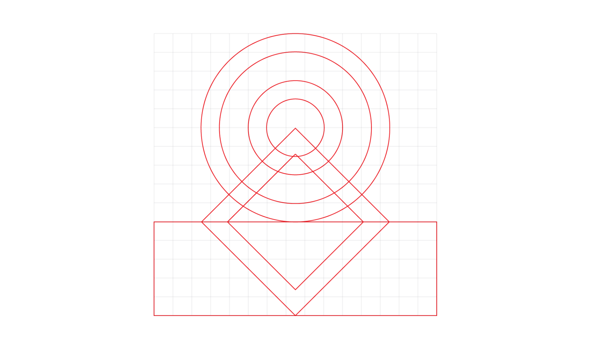
A simple logotype was developed, which was constructed of a minimal circle and triangular shapes. The circle shapes represented the brake products and the control panel button. These elements were positioned behind a triangular pinnacle shape – a pinnacle being the highest point, thus positioning ABT as a market leader.
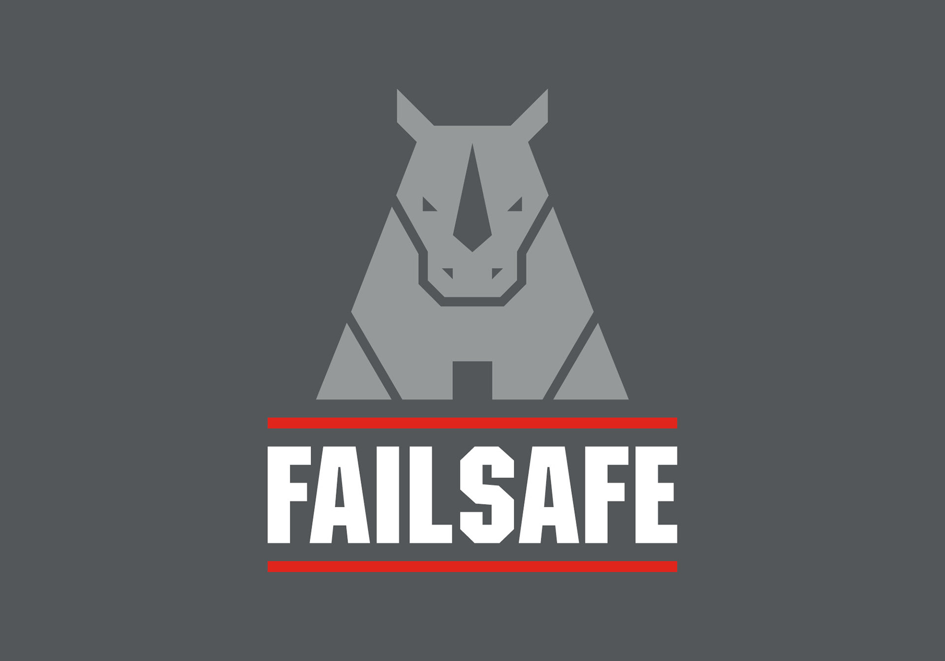
2 \ Failsafe + Failsafe Emergency product logos
The second stage of the ABT logo brief was to design a logo for their main two products, Failsafe and Failsafe Emergency – which are fully sealed, failsafe brakes designed for underground mining vehicles.
Initially, the rhino symbol was a concept used for the ABT logo, however, the client loved it so much that they requested to use it for Failsafe, even though there were other alternative concepts.
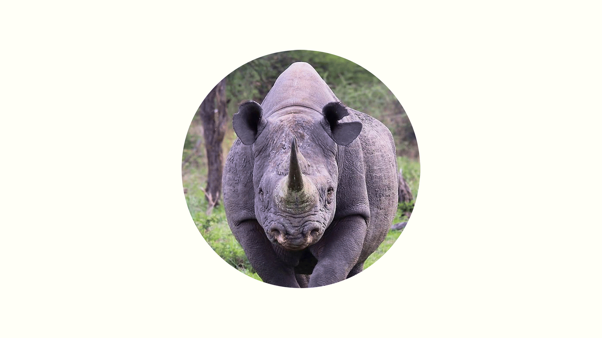
Rhinos themselves are tough, hard-wearing, difficult to move and very protective. These characteristics directly relate back to the ABT brand and its products. If you look carefully, you’ll notice the negative space in the rhino horn and front inner legs that create a letter ‘A’, (as in ABT).