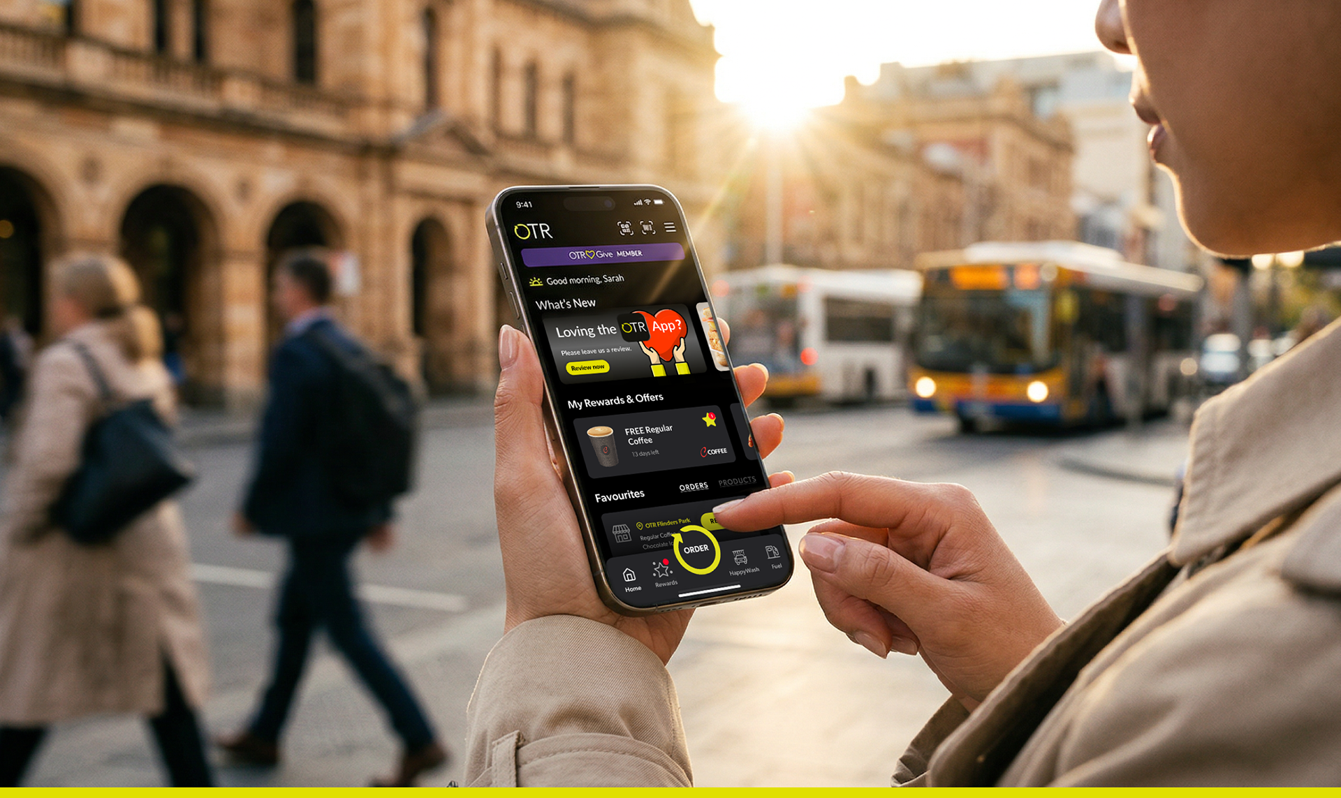
Redefining Convenience with the OTR App Evolution
A comprehensive UX/UI evolution for South Australia’s largest convenience retailer, OTR. Unifying fuel, food, and rewards into a single "Super-App" used by thousands of customers each day.
CLIENT: OTR Group
INDUSTRY: Fuel, Retail & Quick Service Restaurants (QSR)
SCOPE: End-to-end UX/UI Design for:
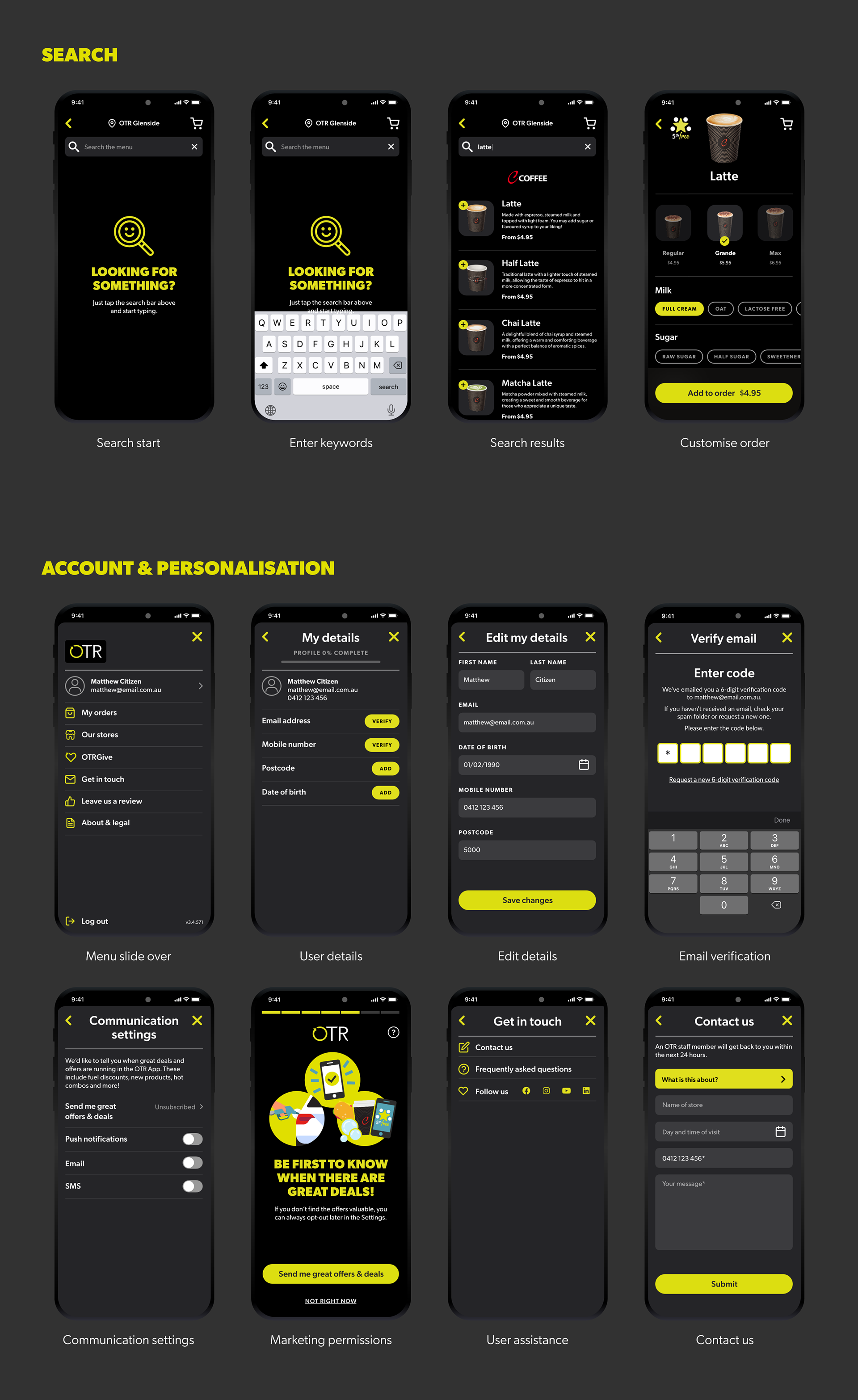
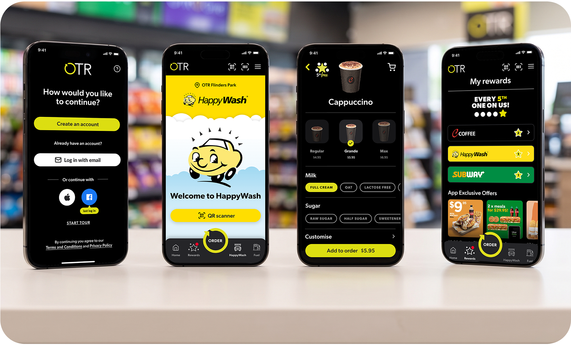
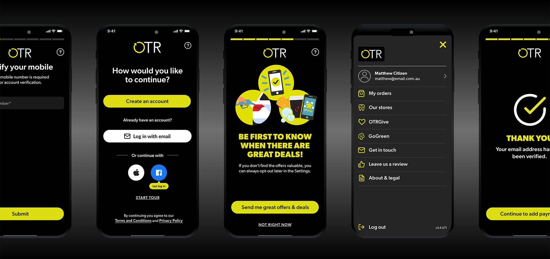
• Getting started: Streamlining the onboarding and account management process to get users into the app faster.
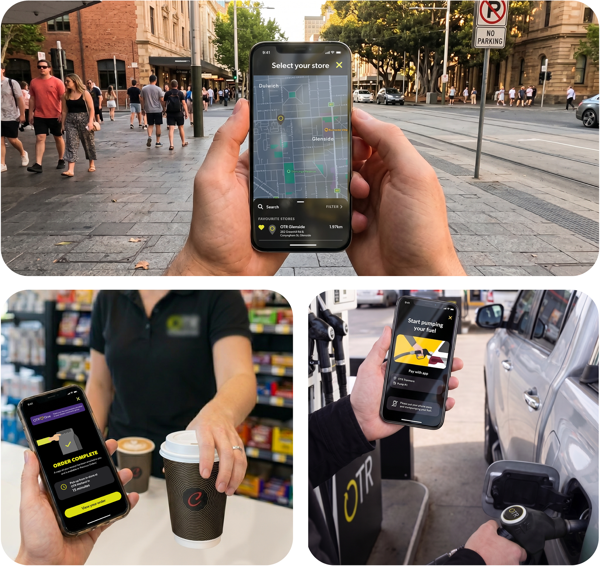
• Powering up: Creating friction-free flows for Scan.Pump.Save™ fuel payments and HappyWash activation via location-based triggers.
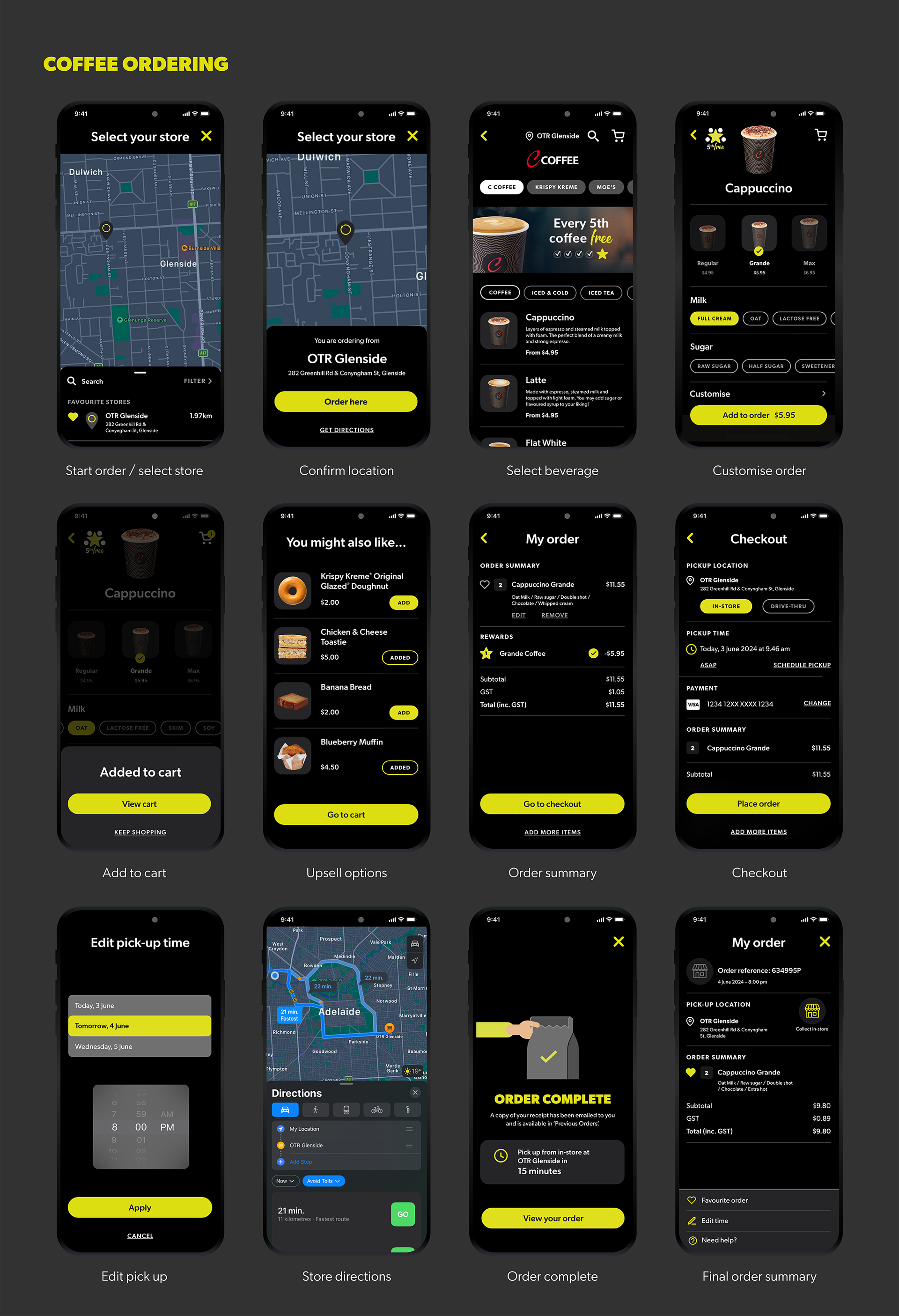
• Ordering & personalisation: Building an intuitive multi-brand "Click & Collect" system featuring secure in-app payments and smart tools for favourites and recent orders.
• Rewarding loyalty: Seamlessly blending OTR Rewards and search capabilities with the OTRGive charity integration.
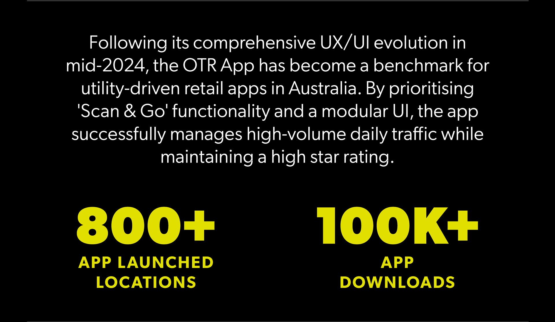
NOTE: Design assets shown represent the 2024 launch phase. As a live product, the application features ongoing refinements by the OTR Digital Team; pricing, products, and promotions shown are for illustrative design purposes and may differ from the current live version.
A streamlined 'Super-App' experience, from onboarding and car wash payments to multi-brand ordering and integrated rewards.
The Goal
To consolidate a fragmented user journey into a single, cohesive "Super-App." Our focus was on reducing friction for time-poor commuters by streamlining a vast multi-brand experience so that paying for fuel, ordering coffee, or redeeming rewards can happen in seconds, not minutes.
A unified design language across the entire OTR ecosystem.
The Process
Strategic partnership
We worked as an embedded design partner, collaborating daily with the OTR Digital Project Manager and the OTR Digital Team. It was a constant cycle of bouncing ideas, challenging and testing logic, and refining the UX as a team to ensure every feature hit the mark.
Evidence-based design
To ensure the best approach for every challenge, we drew on global UX/UI benchmarks and industry best practices. This allowed us to quickly navigate complex problems, such as multi-brand food ordering, with solutions that feel familiar and intuitive from the first tap.
Designing for the moment
We focused heavily on the user’s physical environment. A person pre-ordering coffee from home has different priorities than a driver paying for fuel in a hurry. We designed the UI to adapt to these specific scenarios, ensuring that the most relevant actions are always the easiest to access.
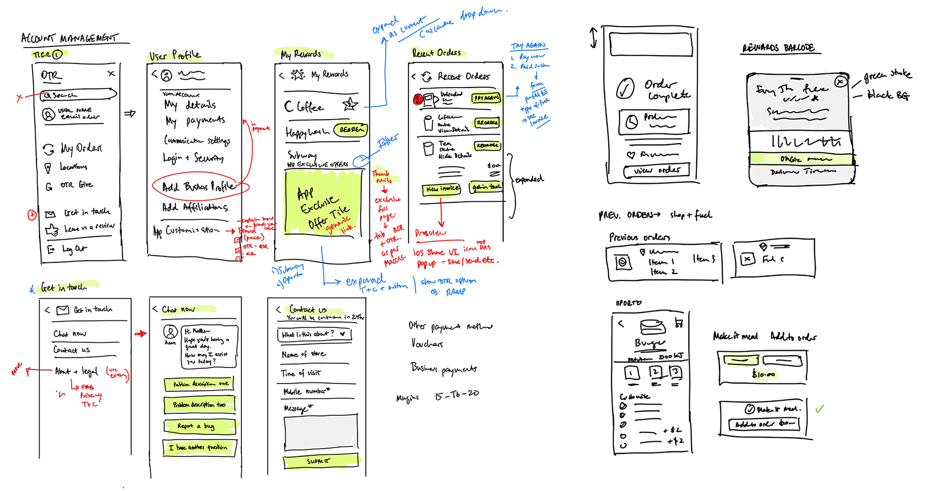
Early-stage architecture mapping for account management and order flows.